Zanzibar vs Mombasa | Cyrchfannau Traeth Arfordirol Gorau
Zanzibar , Tanzanian Mae Archipelago, a Mombasa, canolbwynt arfordirol Kenya, yn ddau o brif draeth Dwyrain Affrica cyrchfannau, pob un yn cynnig tywod gwyn, dyfroedd turquoise, a diwylliannau bywiog. Tra bod y ddau Darparu dianc trofannol, maent yn wahanol o ran awyrgylch, gweithgareddau a hygyrchedd. Hyn Mae'r gymhariaeth yn archwilio traethau, costau, llety, gweithgareddau, diwylliant, hygyrchedd, gorau Amser i ymweld, a vibe i'ch helpu chi i ddewis eich gwyliau arfordirol delfrydol.
Zanzibar vs mombasa: Pa gem arfordirol sy'n gweddu Chi?
Mae swyn ynys Zanzibar a threftadaeth Swahili yn cyferbynnu â Mombasa’s yn brysur Arfordir Trefol a Dyfnder Hanesyddol. P'un a ydych chi'n ceisio getaway ynys dawel Neu ddinas draeth fywiog gyda mynediad saffari hawdd, mae'r canllaw hwn yn tynnu sylw at allwedd gwahaniaethau i lywio'ch penderfyniad.
Thraethau
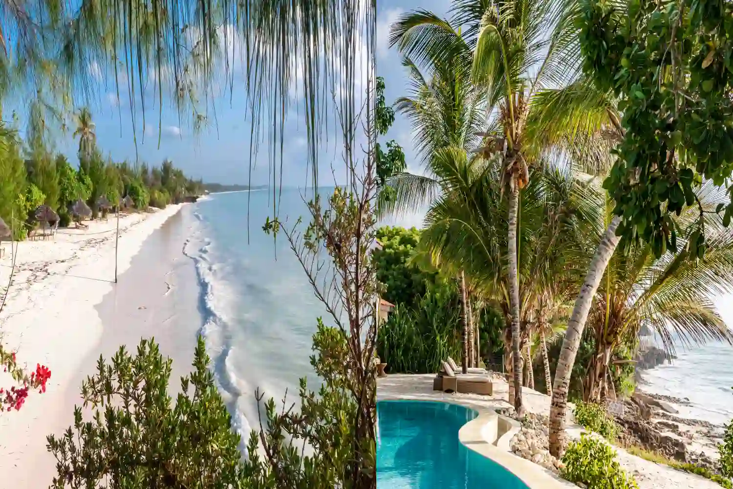
Zanzibar yn enwog am ei draethau pristine fel nungwi, Kendwa, a Paje, yn cynnwys tywod gwyn powdrog a dyfroedd turquoise. Llanw Mae amrywiadau yn effeithio ar nofio ar brydiau, ond mae riffiau cwrel o amgylch mnemba atoll yn cynnig eithriadol snorkelïau a deifio.
Mombasa yn cynnig traethau hardd fel Diani, Nyali, a Bamburi, gyda thywod gwyn meddal a dyfroedd Cefnfor Indiaidd cynnes. Mae Traeth Diani yn arbennig Yn enwog am ei ddarnau hir, di -dor a'i ddyfroedd clir, yn ddelfrydol ar gyfer nofio a chwaraeon dŵr.
Phris
Zanzibar Mae ganddo gost ddyddiol o $ 50- $ 200 y pen. Cyllidebon Mae'r llety yn dechrau ar $ 20- $ 50 y noson, canol-ystod ar $ 80- $ 150, a moethusrwydd cyrchfannau fel Zuri Zanzibar ar $ 300- $ 600. Mae prydau bwyd yn amrywio o $ 5- $ 20, a gweithgareddau Fel snorkelu cost $ 20- $ 50.
Mombasa ychydig yn fwy cyfeillgar i'r gyllideb, gyda chostau dyddiol o $ 40- $ 150 y pen. Mae gwestai cyllideb a gwestai bach yn dechrau ar $ 15- $ 40 y noson, Canol-ystod ar $ 50- $ 120, a chyrchfannau moethus fel Serena Beach Resort ar $ 150- $ 400. Mae prydau bwyd yn costio $ 3- $ 15, ac mae'r gweithgareddau'n amrywio o $ 15- $ 40.
Opsiynau llety
Zanzibar yn cynnig ystod o arosiadau, o westeion gwestai cyllideb fel Bythynnod Traeth Mnani ($ 30- $ 80) i westai bwtîc yn nhref Stone fel Emerson ar Hurumzi ($ 100- $ 200) a chyrchfannau moethus fel Baraza ($ 400- $ 800). Ynys Mae lleoliadau'n darparu naws ddiarffordd.
Mombasa mae ganddo opsiynau amrywiol, o westai traeth cyllideb fel Gwesty Kahama ($ 20- $ 50) i eiddo canol-ystod fel Voyager Beach Resort ($ 80- $ 150) ac mae moethus yn aros fel Sarova Whitesands ($ 150- $ 350). Ei drefol Mae'r lleoliad yn cynnig mynediad hawdd i amwynderau dinas.
Gweithgareddau
Zanzibar yn rhagori mewn gweithgareddau dŵr fel plymio yn mnemba atoll ($ 50- $ 100), snorkelu ($ 20- $ 50), a syrffio barcud yn Paje. Opsiynau ar y tir Cynhwyswch deithiau sbeis ($ 20- $ 40), teithiau cerdded diwylliannol Stone Town ($ 15- $ 30), a Jozani Goed wiGoed ymweliadau ($ 10- $ 20).
Mombasa Yn cynnig chwaraeon dŵr fel snorkelu, deifio ($ 40- $ 80), a sgïo jet ($ 30- $ 60) ar hyd traethau Diani a Nyali. Mae gweithgareddau tir yn cynnwys Teithiau Fort Iesu ($ 5- $ 10), Mombasa Old Town Exploration, a Theithiau Dydd i Gerllaw Parciau Hills Tsavo neu Shimba ($ 50- $ 100).
Ddiwylliant
Zanzibar yn cael ei drwytho yn niwylliant Swahili, gyda Labydia ’ Trefi Mae alïau a restrir gan UNESCO yn arddangos dylanwadau Arabaidd, Indiaidd ac Affrica. Mae planhigfeydd sbeis, reidiau cychod dhow, a pherfformiadau cerddoriaeth taarab yn darparu cyfoethog trochi diwylliannol.
Mombasa yn asio hanes Swahili a threfedigaethol, gyda Fort Jesus a Hen Dref yn adlewyrchu dylanwadau Portiwgaleg ac Arabaidd. Ei farchnadoedd bywiog, lleol Mae bwyd fel biryani, a gwyliau arfordirol yn cynnig dyfnder diwylliannol, er ei fod Yn teimlo'n fwy trefol na Zanzibar.
Hygyrchedd
Zanzibar yn cael ei gyrraedd trwy Abeid Amani Karume International Maes awyr, gyda hediadau o dar es salaam (20 munud, $ 50- $ 100) neu nairobi ($ 150- $ 300). Mae fferïau o dar es salaam yn cymryd 2 awr ($ 35- $ 50). Cost fisas $ 50- $ 100 wrth gyrraedd y mwyafrif o genhedloedd.
Mombasa yn hygyrch trwy Faes Awyr Rhyngwladol Moi, yn uniongyrchol Hedfan o Nairobi (1 awr, $ 50- $ 150) neu hybiau rhyngwladol fel Addis Ababa neu Dubai ($ 200- $ 500). Mynediad i'r ffordd o Nairobi (6-8 awr) neu drenau (4-5 awr, Mae $ 10- $ 30) hefyd yn opsiynau. Costiodd fisas Kenya $ 50 wrth gyrraedd.
Yr amser gorau i ymweld
Zanzibar sydd orau rhwng Mehefin-Hydref a Rhagfyr-Chwefror, gyda tywydd sych a thymheredd o 25-30 ° C. Glawogydd byr (Tachwedd) a glawogydd hir (March-Mai) dod â lleithder ond costau is a llai o dyrfaoedd.
Mombasa yn rhannu hinsawdd debyg, gydag amodau delfrydol o Mehefin-Hydref a Rhagfyr-Chwefror (25-32 ° C). Y tymhorau glawog (Ebrill-Mai a Tachwedd) yn cynnig prisiau is ond cawodydd achlysurol a lleithder uwch.
Naws
Zanzibar mae ganddo vibe paradwys ynys, gan gyfuno traethau tawel gyda phrofiadau diwylliannol bywiog. Mae ei awyrgylch hamddenol yn gweddu i deithwyr Ceisio ymlacio a throchi Swahili dilys i ffwrdd o brysurdeb trefol.
Mombasa yn cynnig vibe bywiog, trefol-arfordirol, gyda phrysur Marchnadoedd, bywyd nos, a mynediad hawdd i draethau a bywyd y ddinas. Mae'n apelio at Y rhai sy'n mwynhau cymysgedd o ymlacio traeth ac archwilio trefol.
Cwestiynau Cyffredin am Zanzibar vs Mombasa
Sy'n fwy cyfeillgar i'r gyllideb, Zanzibar neu Mombasa?
Mae Mombasa yn gyffredinol yn fwy cyfeillgar i'r gyllideb, gyda llety a chiniawa is costau. Gall Zanzibar fod yn fforddiadwy ond mae ganddo opsiynau moethus pricier.
Pa Mae cyrchfan yn cynnig mwy o brofiadau diwylliannol?
Mae Zanzibar yn cynnig profiadau diwylliannol cyfoethocach gyda'i dreftadaeth a'i garreg Swahili Tref. Mae gan Mombasa ddyfnder diwylliannol ond mae'n canolbwyntio mwy ar drefol.
Sydd Gwell ar gyfer chwaraeon a gweithgareddau dŵr?
Mae gan Zanzibar ymyl ar gyfer plymio a snorkelu oherwydd ei riffiau cwrel, tra Mae Mombasa yn cynnig chwaraeon dŵr tebyg ond mae'n rhagori mewn trefol a hanesyddol gwibdeithiau.
A allaf gyfuno Zanzibar a Mombasa mewn un daith?
Ydy, mae cyfuno Zanzibar a Mombasa yn ymarferol trwy hediad byr (1 awr, $ 100- $ 200) neu fferi, gan ei gwneud hi'n hawdd mwynhau'r ddau gyrchfan mewn un daith.
Meddyliau Terfynol
Eich dewis rhwng Zanzibar a Mombasa yn dibynnu ar eich dewisiadau teithio a'ch cyllideb. Mae Zanzibar yn berffaith ar gyfer y rheini ceisio dianc o ynys gyda diwylliant cyfoethog Swahili, traethau pristine, a Plymio o safon fyd-eang, sy'n ddelfrydol ar gyfer getaway tawel ond anturus. Siwtiau Mombasa teithwyr sy'n mwynhau dinas arfordirol fywiog gyda llety fforddiadwy, gweithgareddau amrywiol, a mynediad hawdd i gyrchfannau saffari Kenya. Mae'r ddau yn cynnig Profiadau arfordirol syfrdanol o Ddwyrain Affrica, ond mae Zanzibar yn gwyro tuag at dawelwch Dilysrwydd, tra bod Mombasa yn darparu cyfuniad trefol trefol bywiog, hygyrch.