transformación: traducido (-50%); Ancho: 16px; Altura: 16px; cursor: puntero; Color: #440310; Font-peso: 700; Text-Align: Center; Línea de altura: 16px } .Mobile-Menu-Container .Slicknav_Nav .Slicknav_arrow :: After { Contenido: "+"; tamaño de fuente: 16px } .Mobile-Menu-Container .Slicknav_Nav .Slicknav_arrow.open :: After { contenido: "-" } .slicknav_btn .slicknav_icon span { Color de fondo: var (-bs-white); Pantalla: bloque; Posición: Absoluto; Ancho: 20px; Altura: 2px; left: 50%; transform: translate(-50%, -50%); transition: all 0.3s } .slicknav_btn .slicknav_icon span:before, .slicknav_btn .slicknav_icon span:after { background-color: var(--bs-white); content: ""; position: absolute; width: 100%; height: 2px; left: 0; transition: all 0.3s } .slicknav_btn .slicknav_icon span:before { top: -6px } .slicknav_btn .slicknav_icon span:after { top: 6px } .slicknav_btn.slicknav_open .slicknav_icon span { background-color: #fff0 } .slicknav_btn.slicknav_open .slicknav_icon span:before { top: 0; transform: rotate(45deg) } .slicknav_btn.slicknav_open .slicknav_icon span:after { top: 0; transform: rotate(-45deg) } .sidebar > div { padding-bottom: 40px } .sidebar .booking-form-inner { border-radius: 25px; padding: 40px 30px } .sidebar .booking-form-inner h3, .sidebar .booking-form-inner p { text-align: center; color: var(--bs-white) } .sidebar .booking-form { display: flex; flex-wrap: wrap; margin: 0 -10px } .sidebar .booking-form p { padding: 0 10px; width: 100%; margin-bottom: 20px } .sidebar .booking-form p.width-5 { width: 50% } .sidebar .booking-form p label { margin-bottom: 5px } .sidebar .booking-form p input { width: 100% !important } .sidebar .booking-form p button { background-color: #fff0; width: 100% } .sidebar .package-list { background-size: cover; background-repeat: no-repeat; background-position: center center; border-radius: 25px; overflow: hidden; padding: 30px; position: relative; z-index: 1 } .sidebar .package-list h4 { background-color: #f8f8f8; border-radius: 25px; padding: 10px 20px; text-align: center; font-weight: 500; margin-bottom: 20px } .sidebar .package-list ul { margin: 0; padding: 0 } .sidebar .package-list ul li { list-style: none; margin-bottom: 8px; padding-bottom: 8px; border-bottom: 1px solid rgb(167 167 167 / .31) } .sidebar .package-list ul li:last-child { margin-bottom: 0; border-bottom: none; padding-bottom: 0 } .sidebar .package-list ul li a { color: var(--bs-white) } .sidebar .package-list ul li a i { margin-right: 8px } .site-footer { background-color: rgb(34 54 69 / .98); padding-top: 80px } .site-footer .top-footer { padding-bottom: 80px } .site-footer .footer-logo { margin-bottom: 20px } .site-footer .bottom-footer { background-color: #223645; padding: 20px 0 } .site-footer .copy-right { color: var(--bs-white) } .site-footer .copy-right a { color: var(--bs-white) } .site-footer .copy-right a:hover { color: #440310 } .site-footer .lower-footer { border-top: 1px solid rgb(255 255 255 / .14); padding-top: 35px } .site-footer .lower-footer .social-icon { margin-bottom: 20px } .site-footer .lower-footer .social-icon li { margin: 0 5px } .site-footer .lower-footer .social-icon li a { border: 1px solid #626672; border-radius: 100%; color: var(--bs-white); display: block; width: 35px; height: 35px; line-height: 35px; text-align: center; transition: all 0.4s } .site-footer .lower-footer .social-icon li a:hover { background-color: #440310; border-color: #440310 } .site-footer .footer-newsletter p { color: var(--bs-white); margin-bottom: 20px } .site-footer .footer-newsletter .newsletter { display: flex; flex-wrap: wrap } .site-footer .footer-newsletter input[type="email"] { flex-grow: 1; border-color: rgb(255 255 255 / .35); margin-right: 20px } .site-footer .footer-newsletter button { background-color: #fff0 } .site-footer .footer-menu ul { margin: 0; padding: 0; font-size: 0 } .site-footer .footer-menu ul li { list-style: none; display: inline-block; position: relative; padding: 0 10px } .site-footer .footer-menu ul li:before { content: "|"; position: absolute; top: 0; right: -2px; font-size: 14px; color: #b6b6b6 } .site-footer .footer-menu ul li:last-child:before { display: none } .site-footer .footer-menu ul li a { color: var(--bs-white); font-size: 13px } .site-footer .footer-menu ul li a:hover, .site-footer .footer-menu ul li a:focus { color: #440310 } .footer-primary .widget { color: #e0e0e0; margin-bottom: 30px } .footer-primary .widget .widget-title { color: var(--bs-white); font-size: 16px; font-weight: 500; line-height: 1.1; margin-bottom: 30px; text-transform: uppercase } .footer-primary .widget .widget-title:after { background-color: var(--bs-orange); content: ""; display: table; height: 2px; width: 50px; margin-top: 10px } .footer-primary .widget ul li { margin-bottom: 10px; border-bottom: none } .footer-primary .widget ul li a { color: var(--bs-white) } .footer-primary .widget ul li a:hover, .footer-primary .widget ul li a:focus, .footer-primary .widget ul li a:active { color: #440310 } .widget { margin-bottom: 30px } .widget a { display: block } .widget .widget-title { margin-bottom: 30px } .widget ul { margin: 0; padding: 0 } .widget ul li { list-style: none } .widget ul li a { color: #383838 } .widget ul li a:hover { color: #440310 } .widget.widget-post-thumb li { margin-bottom: 15px; padding-bottom: 15px; border-bottom: 1px solid #e6e6e6 } .widget.widget-post-thumb li:before, .widget.widget-post-thumb li:after { content: ""; display: block; clear: both } .widget.widget-post-thumb li:last-child { margin-bottom: 0; padding-bottom: 0; border-bottom: none } .widget.widget-post-thumb .post-thumb { width: 80px; float: left; position: relative } .widget.widget-post-thumb .post-thumb img { border-radius: 15px } .widget.widget-post-thumb .post-content { float: right; width: calc(100% - 100px) } .widget.widget-post-thumb .post-content h5, .widget.widget-post-thumb .post-content h6 { margin-bottom: 5px } .widget.widget-post-thumb .post-content p { margin-bottom: 0; font-size: 14px } .widget.widget-post-thumb .post-content .entry-meta { margin-left: -8px; margin-right: -8px } .widget.widget-post-thumb .post-content .entry-meta span { padding: 0 8px; position: relative } .widget.widget-post-thumb .post-content .entry-meta span:before { color: #b6b6b6; content: "|"; font-size: 13px; position: absolute; right: 0; top: 0 } .widget.widget-post-thumb .post-content .entry-meta span:last-child:before { display: none } .widget.widget-post-thumb .post-content .entry-meta a { color: #787878; display: inline-block; font-size: 13px; line-height: 1.1 } .widget.widget-post-thumb .post-content .entry-meta a:hover, .widget.widget-post-thumb .post-content .entry-meta a:focus { color: #440310 } .widget.widget_text ul { margin-top: 20px } .widget.widget_text ul li { margin-bottom: 10px; padding-left: 25px; position: relative } .widget.widget_text ul li:last-child { margin-bottom: 0 } .widget.widget_text ul li i { color: var(--bs-white); position: absolute; left: 0; top: 4px; width: 16px; height: 16px; background-size: contain; background-repeat: no-repeat } .inner-banner-wrap { padding-bottom: 95px } .inner-baner-container { background-size: cover; background-repeat: no-repeat; background-position: center center; text-align: center; position: relative } .inner-baner-container:before { background-color: #151515; content: ""; display: block; opacity: .65; width: 100%; height: 100%; top: 0; left: 0; right: 0; bottom: 0; position: absolute } .inner-baner-container .inner-banner-content { padding-top: 120px; padding-bottom: 135px; position: relative; color: var(--bs-white) } .inner-baner-container .page-title { color: var(--bs-white); line-height: 1.1; text-transform: uppercase; margin-bottom: 0 } .primary-bg { background-color: var(--bs-orange) } .overlay { background-color: rgb(0 0 0 / .6); position: absolute; top: 0; left: 0; width: 100%; height: 100%; z-index: -1 } .social-icon ul { margin: 0; padding: 0; font-size: 0 } .social-icon li { display: inline-block; list-style: none; margin: 0 5px } .social-icon a { font-size: 16px; color: #404040; transition: color 0.4s } .social-icon a:hover, .social-icon a:focus, .social-icon a:active { color: #440310 } .clearfix:before, .clearfix:after, .entry-content:before, .entry-content:after, .comment-content:before, .comment-content:after, .site-header:before, .site-header:after { content: ""; display: block; clear: both } .package-inner-page { padding-bottom: 100px } @media (min-width: 992px) { .right-sidebar { padding-right: 40px } .mobile-menu-container { display: none !important } .navigation-container { display: flex !important } .navigation-container ul > li.menu-item-has-children:hover > ul { display: block } .navigation-container ul ul ul { left: 100%; top: 0 } .navigation-container ul > li:hover > a:after { transform: rotate(180deg) } .bottom-header { background-color: var(--bs-white); box-shadow: 0 -3px 10px rgb(0 0 0 / .2); position: fixed; top: 0; width: 100%; left: 0; z-index: 999 } .navigation-container ul > li > a { color: #440310 } } @media (max-width: 991px) { .mobile-menu-container { display: block !important; position: relative; z-index: 1000; background-color: transparent !important } .bottom-header { border-bottom: 1px solid rgb(255 255 255 / .25); padding: 12px 0 } .mobile-menu-container { background-color: var(--bs-white); box-shadow: 0 -3px 10px rgb(0 0 0 / .2); position: fixed; top: 0; width: 100%; left: 0; z-index: 999 } .mobile-menu-container .slicknav_nav { min-height: fit-content; height: 100%; overflow-y: scroll; position: absolute; width: 100%; left: 0; right: 0; z-index: 999 } .mobile-menu-container .slicknav_menutxt, .mobile-menu-container .slicknav_btn .slicknav_icon span, .mobile-menu-container .slicknav_btn .slicknav_icon span:before, .mobile-menu-container .slicknav_btn .slicknav_icon span:after { color: #440310 } .sidebar .booking-form-wrap { margin-top: 40px } .site-footer .lower-footer .text-right { text-align: initial !important } .site-footer .footer-newsletter { margin-bottom: 20px } .footer-primary .widget { margin-bottom: 30px } } @media (max-width: 768px) { th, td { padding: 10px; font-size: 14px } } @media (max-width: 767px) { h1 { font-size: 36px } h2 { font-size: 28px } h3 { font-size: 20px } h4 { font-size: 16px } h5 { font-size: 14px } h6 { font-size: 12px } } @media (max-width: 575px) { body { font-size: 14px } .site-logo img { max-width: 80px } .round-btn, .outline-btn { font-size: 14px; padding: 12px 20px } .outline-btn { padding: 10px 20px } .package-inner-page { padding-bottom: 60px } .inner-banner-wrap { padding-bottom: 55px } .inner-baner-container .inner-banner-content { padding-top: 80px; padding-bottom: 80px } .inner-baner-container .page-title { font-size: 30px } .site-footer { padding-top: 50px } .site-footer .top-footer { padding-bottom: 25px } .site-footer .footer-newsletter input[type="email"] { height: 50px; margin-right: 0 } .site-footer .footer-newsletter button { width: 100%; margin-top: 10px } .site-footer .footer-menu ul li a { font-size: 12px; font-weight: 400 } input[type="text"], input[type="email"], input[type="url"], input[type="password"], input[type="search"], input[type="number"], input[type="tel"], input[type="range"], input[type="date"], input[type="month"], input[type="week"], input[type="time"], input[type="datetime"], input[type="datetime-local"], input[type="color"] { height: 55px } } ul, ol { list-style: none } .destination-item { background-size: cover; background-position: center center; background-repeat: no-repeat } .destination-item a { color: #223645 } .destination-item a:hover { color: #440310 !important } input { min-width: 100% !important; height: 50px } .destination-item { display: -webkit-box; display: -moz-box; display: -ms-flexbox; display: -webkit-flex; display: flex; -webkit-flex-wrap: wrap; -moz-flex-wrap: wrap; -ms-flex-wrap: wrap; flex-wrap: wrap; -webkit-align-items: flex-end; -moz-align-items: flex-end; -ms-align-items: flex-end; -ms-flex-align: end; align-items: flex-end; -webkit-border-radius: 25px; -moz-border-radius: 25px; -ms-border-radius: 25px; border-radius: 25px; min-height: 425px; margin-bottom: 50px } .destination-item .destination-content { background-color: #fff; -webkit-border-radius: 25px; -moz-border-radius: 25px; -ms-border-radius: 25px; border-radius: 25px; margin: 20px; padding: 22px 20px; position: relative } .destination-item .cat-link { color: #f99300; display: block; font-size: 13px; margin-bottom: 8px; text-transform: uppercase } .destination-item h3 { text-transform: capitalize; margin-bottom: 6px } .destination-item p:last-child { margin-bottom: 0 } .destination-item .rating-start-wrap { background-color: #f99300; -webkit-border-radius: 25px; -moz-border-radius: 25px; -ms-border-radius: 25px; border-radius: 25px; padding: 4px 12px; position: absolute; right: 24px; top: -12px } .destination-item .rating-start-wrap .rating-start:before { color: #c3c3c3 } .destination-item .rating-start-wrap .rating-start span:before { color: #fff } @media screen and (max-width: 575px) { .destination-item { margin-bottom: 30px } } .input-date-picker { display: inline-block; width: 100%; max-width: 250px; padding: 10px 15px; font-size: 16px; line-height: 1.5; color: #333; background-color: #fff; border: 1px solid #e9ecef; border-radius: 8px; box-shadow: 0 2px 5px rgb(0 0 0 / .1); transition: border-color 0.3s ease, box-shadow 0.3s ease; cursor: pointer; pointer-events: auto; user-select: auto } .input-date-picker:hover { border-color: #fd7e14; box-shadow: 0 3px 10px rgb(0 0 0 / .15) } .input-date-picker:focus { outline: none; border-color: #fd7e14; box-shadow: 0 0 0 3px rgb(253 126 20 / .3) } .input-date-picker::placeholder { color: #6c757d; opacity: .7 } .input-date-picker::-webkit-calendar-picker-indicator { cursor: pointer; padding: 5px; margin-left: 5px; background-size: 20px; z-index: 1; pointer-events: auto; opacity: .7; transition: opacity 0.3s ease } .input-date-picker:hover::-webkit-calendar-picker-indicator { opacity: 1 } .input-date-picker:disabled { background-color: #f8f9fa; border-color: #d1d3e2; color: #6c757d; cursor: not-allowed; pointer-events: none } @media screen and (max-width: 575px) { .input-date-picker { max-width: 100%; font-size: 14px; padding: 8px 12px } } .input-date-picker:focus-visible { outline: 2px solid #fd7e14; outline-offset: 2px } h1.text-center { font-size: clamp(1.5rem, 3vw, 2.5rem); text-transform: uppercase; text-align: center; letter-spacing: .05em; font-weight: 700 } h1 { font-size: clamp(1.5rem, 3vw, 2.5rem); text-transform: uppercase; letter-spacing: .05em; font-weight: 700 } h2.text-center { font-size: clamp(1.3rem, 2.5vw, 2rem); text-align: center; letter-spacing: .05em; font-weight: 700 } h2 { font-size: clamp(1.3rem, 2.5vw, 2rem); letter-spacing: .05em; font-weight: 700 } h3.text-center { font-size: clamp(1.1rem, 2vw, 1.75rem); text-align: center; letter-spacing: .05em; font-weight: 700 } h3 { font-size: clamp(1.1rem, 2vw, 1.75rem); letter-spacing: .05em; font-weight: 700 } h4.text-center { font-size: clamp(0.9rem, 1.8vw, 1.5rem); text-align: center; letter-spacing: .05em; font-weight: 600 } h4 { font-size: clamp(0.9rem, 1.8vw, 1.5rem); letter-spacing: .05em; font-weight: 600 } h5.text-center { font-size: clamp(0.8rem, 1.6vw, 1.25rem); text-align: center; letter-spacing: .05em; font-weight: 600 } h5 { font-size: clamp(0.8rem, 1.6vw, 1.25rem); letter-spacing: .05em; font-weight: 600 } h6.text-center { font-size: clamp(0.7rem, 1.4vw, 1rem); text-align: center; letter-spacing: .05em; font-weight: 600 } h6 { font-size: clamp(0.7rem, 1.4vw, 1rem); letter-spacing: .05em; font-weight: 600 } @media (max-width: 768px) { h1.text-center, h1 { font-size: clamp(1.25rem, 2.5vw, 1.75rem) } h2.text-center, h2 { font-size: clamp(1.1rem, 2.2vw, 1.5rem) } h3.text-center, h3 { font-size: clamp(1rem, 2vw, 1.3rem) } h4.text-center, h4 { font-size: clamp(0.85rem, 1.7vw, 1.2rem) } h5.text-center, h5 { font-size: clamp(0.75rem, 1.5vw, 1rem) } h6.text-center, h6 { font-size: clamp(0.65rem, 1.3vw, 0.9rem) } } @media (max-width: 480px) { h1.text-center, h1 { font-size: clamp(1rem, 2vw, 1.25rem); text-transform: none; letter-spacing: normal } h2.text-center, h2 { font-size: clamp(0.9rem, 1.8vw, 1.1rem); text-transform: none; letter-spacing: normal } h3.text-center, h3 { font-size: clamp(0.8rem, 1.6vw, 1rem); text-transform: none; letter-spacing: normal } h4.text-center, h4 { font-size: clamp(0.7rem, 1.4vw, 0.9rem); text-transform: none; letter-spacing: normal } h5.text-center, h5 { font-size: clamp(0.65rem, 1.3vw, 0.8rem); text-transform: none; letter-spacing: normal } h6.text-center, h6 { font-size: clamp(0.6rem, 1.2vw, 0.75rem); text-transform: none; letter-spacing: normal } } main.site-main { padding-top: clamp(60px, 5vw, 60px) } .single-packge-wrap .package-content-detail .package-include ul { display: -webkit-box; display: -moz-box; display: -ms-flexbox; display: -webkit-flex; display: block; -webkit-flex-wrap: wrap; -moz-flex-wrap: wrap; -ms-flex-wrap: wrap; flex-wrap: wrap } .single-packge-wrap .package-content-detail .package-include ul li { width: 100% }
Kilimanjaro vs Everest | Trekking de montaña superior Destinos
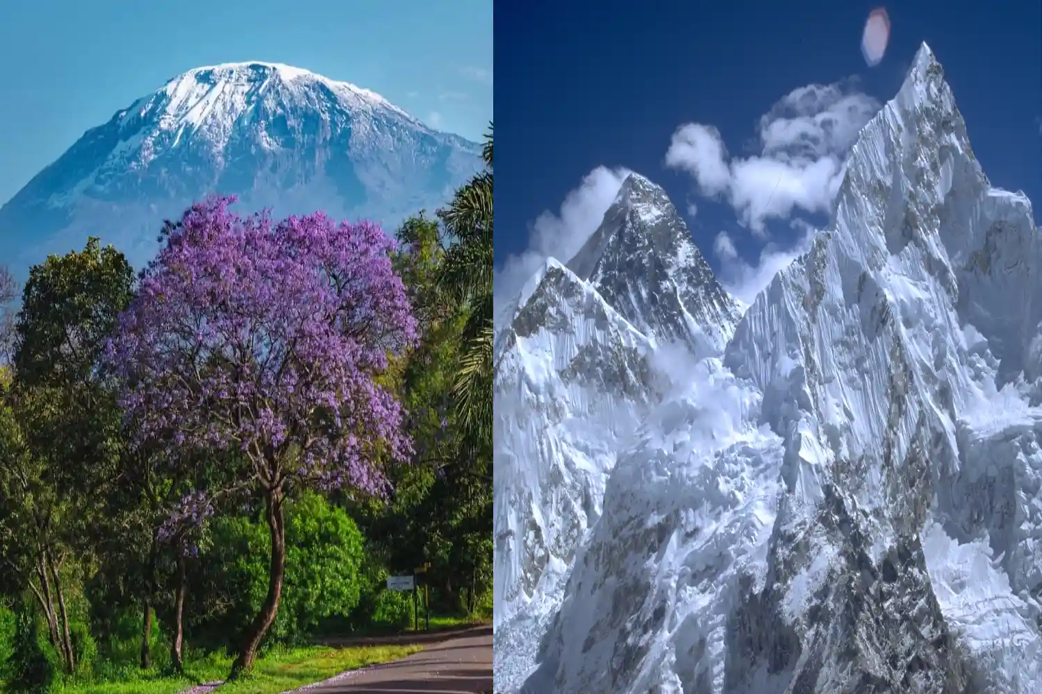
Monte Kilimanjaro en Tanzania y el Monte Everest en Nepal son dos de los destinos de trekking más emblemáticos del mundo, cada uno ofreciendo una aventura única a gran altitud. Kilimanjaro, el pico más alto de África, es un subida no técnica accesible para muchos, mientras que el Everest, la montaña más alta del mundo, es una Desafío formidable para alpinistas experimentados. Esta comparación explora la dificultad, el paisaje, costos, adaptaciones, actividades, accesibilidad, mejor momento para escalar y preparación para ayudar Eliges tu aventura ideal de montaña.
Envíenos un mensaje