Ngorongoro Crater vs Lake Manyara | Meilleur safari tanzanien Destination
Après une montée exaltante Monter Kilimanjaro , un safari dans le circuit nord de la Tanzanie est un moyen fantastique de continuer votre aventure. Ngorongoro Cratère et Lac Parc National de Manyara , les deux destinations emblématiques, offrent des expériences de safari distinctes adapté à différentes préférences de voyageurs. Cet article compare les deux en fonction de la nature de Le parc, la faune, le prix, les options d'hébergement, les attractions, les expériences et les activités, accessibilité, meilleur moment pour visiter et niveaux de foule pour vous aider à choisir le parfait safari post-kilimanjaro.
Ngorongoro Crater vs Lake Manyara: qui convient Toi?
Le cratère de Ngorongoro et le parc national du lac Manyara sont des destinations hors concours Circuit de safari nord de la Tanzanie, chacun offrant des paysages uniques et expériences de la faune. Que vous recherchiez une faune à haute densité spectacle dans une caldeira volcanique ou un parc compact avec des lions d'escalade d'arbres et une vie d'oiseaux vibrante, ce guide décompose les principales différences pour vous aider Choisissez la destination de safari idéale.
Nature du parc
Cratère de ngorongoro est un site du patrimoine mondial de l'UNESCO et l'un des Les plus grandes calderas volcaniques intactes au monde, couvrant environ 260 kilomètres carrés. Connu sous le nom de «Garden of Eden», il dispose d'un sol de cratère luxuriant entouré de murs escarpés, créant un écosystème autonome avec des prairies, des marécages, Les forêts, et un lac de soda, offrant une expérience de safari compacte mais à couper le souffle.
Parc national du lac Manyara , couvrant environ 330 carrés kilomètres, est un parc plus petit dominé par le lac alcalin Manyara, qui occupe environ les deux tiers de sa région. Le parc possède divers écosystèmes, y compris les forêts des eaux souterraines, les forêts d'Acacia et les plaines inondables herbeuses, tous Contre l'escarpement dramatique de Great Rift Valley, offrant un condensé encore Expérience de safari variée.
Faune
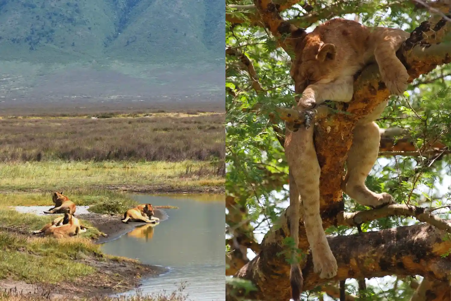
Cratère de ngorongoro est réputé pour sa forte densité de la faune, hébergeant plus de 25 000 animaux dans sa zone confinée. C'est l'un des meilleurs endroits pour repérer le Grandiose CINQ ( Lions , Léopards , Éléphants , Buffles , et Rhinocéros ). Le cratère abrite de grandes populations de lions, d'hyènes, de zèbres, de gnous, et les rhinocéros noirs en voie de disparition critique. Flamingos et autres oiseaux Fréquentent le lac Soda, soutenu par l'écosystème unique du cratère.
Parc national du lac Manyara est célèbre pour son aspect des arbres Lions, un comportement rare qui attire de nombreux visiteurs. Le parc accueille des éléphants, Les hippopotames, les girafes, les zèbres et les grands troupeaux de buffles. Le lac dessine des milliers de Flamingos pendant la saison des pluies, créant un spectacle rose vibrant, aux côtés Plus de 400 espèces d'oiseaux, dont des pélicans et des cigognes. Alors que les léopards et les rhinocéros sont présents, ils sont plus difficiles à repérer, ce qui rend les cinq Big Five moins probables.
Prix
Cratère de ngorongoro est une destination de safari premium avec plus Coûts dus aux frais de conservation dans la zone de conservation de Ngorongoro. Frais d'entrée sont environ 70 $ à 80 $ par personne par jour, plus des frais de véhicule et un cratère Frais de service d'environ 200 $ à 300 $ par véhicule. Coûts de safari, y compris les guides et le transport, varie généralement de 250 $ à 500 $ par personne par jour, selon le Tour opérateur et taille du groupe.
Parc national du lac Manyara est plus convivial, avec entrée Frais d'environ 45 $ à 55 $ par personne et par jour. Les coûts de safari, y compris les lecteurs de jeux et Guides, varient de 120 $ à 300 $ par personne par jour, ce qui en fait une option abordable, Surtout pour les excursions d'une journée en raison de sa proximité avec Arusha.
Options d'hébergement
Cratère de ngorongoro propose des hébergements principalement le long du Crater Rim, maximisation des vues panoramiques. Lodges de luxe comme Ngorongoro Serena Safari Lodge et et Beyond Ngorongoro Crater Lodge fournissent des commodités haut de gamme et Vistas superbes, coûtant 300 $ à 800 $ par nuit. Des options de milieu de gamme, comme Ngorongoro Sopa Lodge, varie de 150 $ à 300 $ par nuit. Les voyageurs à petit budget peuvent rester dans des campings publics comme le camping Simba, à partir de 30 $ à 50 $ par personne par nuit.
Parc national du lac Manyara a moins d'options d'hébergement en raison de son taille plus petite, mais offre une plage solide. Lodges de luxe comme le lac Manyara Serena Safari Lodge et et Beyond Lake Manyara Tree Lodge coûtent 300 $ à 700 $ par nuit. Les options de milieu de gamme, telles que Migunga Tented Camp, varient de 80 $ à 200 $ par nuit. Les campings à petit budget, comme le camping Panorama, commencent à 20 $ à 40 $ par personne par nuit, Souvent idéalement situé près de l'entrée du parc.
Attractions
Cratère de ngorongoro est une attraction singulière, avec le cratère lui-même comme tirage principal. Les faits saillants incluent la forêt de Lerai, un acacia luxuriante Foodland regorgeant d'animaux sauvages; Lac Magadi, un lac Soda fréquenté par Flamingos; et le marais Gorigor, un hotspot pour les hippopotames et les oiseaux. Le cratère La taille compacte garantit des observations de la faune rapprochée fréquentes.
Parc national du lac Manyara centres autour du lac pittoresque Manyara, qui attire les flamants et autres oiseaux d'eau. La forêt des eaux souterraines Près de l'entrée du parc est idéal pour repérer les singes et les éléphants, tandis que le Hot Springs à Maji Moto et l'escarpement de Rift Valley offrent une superbe fond de fond. La disposition compacte du parc assure un accès rapide à sa clé attractions.
Expériences et activités
Cratère de ngorongoro propose des lecteurs de jeux classiques dans le cratère, d'une durée généralement durable de 4 à 6 heures en raison du règlement de conservation limitant le temps plancher du cratère. Des safaris à pied guidés sont disponibles dans le Ngorongoro plus large La zone de conservation et les visites culturelles dans les villages de Maasaï offrent un aperçu de Traditions locales. Safaris en ballon à air chaud, coûtant environ 500 $ à 600 $ par personne, Fournir une perspective aérienne unique du cratère.
Parc national du lac Manyara Excelle dans les lecteurs de jeux courts, idéal pour des safaris d'une demi-journée ou d'une journée en raison de sa petite taille. Activités uniques Incluez les visites de passerelles à travers la forêt des eaux souterraines pour une vue sur les arbres et des visites à vélo le long des sentiers désignés. Visites culturelles à Mto Wa Mbu à proximité Le village fournit une connexion culturelle et l'observation des oiseaux est un moment fort, Surtout pendant la saison des pluies.
Accessibilité
Cratère de ngorongoro est situé à environ 180 kilomètres d'Arusha, un 3-4 heures de route sur des routes principalement pavées, ce qui le rend relativement accessible. Ça fait partie du circuit de safari nord, mais l'accès au sol du cratère nécessite 4x4 véhicules et permis, en ajoutant une complexité logistique.
Parc national du lac Manyara est très accessible, seulement 80 Kilomètres d'Arusha, à environ 1,5 heure de route sur de bonnes routes. Sa proximité et La petite taille le rend parfait pour les visites rapides, avec un accès facile via le 4x4 standard Véhicules et restrictions minimales de permis.
Meilleur moment pour visiter
Cratère de ngorongoro est une destination toute l'année en raison de son Présence de la faune cohérente. La saison sèche (de juin à octobre) est idéale pour le jeu La vision des animaux se rassemble autour des sources d'eau. La saison des pluies (novembre à Mai) offre une verdure luxuriante et moins de foules, bien que certaines routes puissent être boueuses.
Parc national du lac Manyara est excellent toute l'année, avec le humide Saison (novembre à mai) étant le meilleur pour les flamants et les oiseaux migrateurs, complété par des paysages luxuriants. La saison sèche (juin à octobre) offre mieux Conditions routières et mammifères plus visibles, bien que le lac puisse rétrécir.
Foule
Cratère de ngorongoro est l'un des safari les plus populaires de la Tanzanie destinations, attirant des foules importantes, en particulier pendant le pic sec Saison (juin à septembre). Sa petite taille peut conduire à un véhicule concentré Le trafic, ce qui peut réduire le sentiment de nature sauvage pour certains voyageurs.
Parc national du lac Manyara voit des foules modérées, en particulier Pendant la haute saison, en raison de sa popularité pour les excursions d'une journée. Sa taille plus petite peut Rendre les véhicules plus concentrés, mais il est généralement moins occupé que Ngorongoro, offrant une expérience relativement paisible.
FAQ sur Ngorongoro Crater vs Lake Manyara National Park
Quel parc est Mieux vaut voir les Big Five?
Ngorongoro Crater est le meilleur choix pour repérer tous les Big Five, y compris les rares rhinocéros noirs, en raison de sa forte densité de la faune. Lac Manyara propose des lions d'escalade et d'autres animaux sauvages mais est moins susceptible de fournir des observations de rhinocéros ou de léopards.
Est ngorongoro ou le lac Manyara plus budgétaire?
Le lac Manyara est plus favorable au budget en raison des frais d'entrée inférieurs et de son aptitude pour des excursions d'une journée. Les frais plus élevés de Ngorongoro et les hébergements premium le rendent plus cher.
Quel parc est le meilleur pour une courte visite?
Le lac Manyara est idéal pour les visites courtes en raison de sa proximité avec Arusha et Compact Taille, parfaite pour un safari d'une demi-journée ou d'une journée. Ngorongoro a besoin de plus de temps en raison des exigences de voyage et de permis.
Puis-je combiner les deux parcs en un safari?
Oui, les deux parcs font partie du circuit de safari nord de la Tanzanie et peuvent être facilement Combiné dans un itinéraire de plusieurs jours, souvent aux côtés de Serengeti ou Tarangire.
Réflexions finales
Choisir entre Ngorongoro Cratère et Lac Parc National de Manyara Cela dépend de vos priorités de safari. Ngorongoro Cratère est idéal pour les voyageurs à la recherche d'une faune compacte et haute densité Expérience avec une forte chance de repérer les Big Five dans une superbe caldera réglage, malgré des coûts et des foules plus élevés. Lac Manyara National Parc est parfait pour ceux qui veulent un safari rapide et rapide avec des attractions uniques comme les lions d'escroquerie d'arbres, les flamantsos et la canopée entrent Un parc compact et accessible. Les deux font partie du circuit nord de la Tanzanie, faisant Ils sont faciles à combiner pour une aventure de safari complète. Que vous choisissiez Le cratère emblématique ou les écosystèmes dynamiques de Manyara, tous deux promettent Expériences inoubliables post-kilimanjaro.