Tarangire vs Lake Manyara | Meilleur safari tanzanien Destination
Après conquête Monter Kilimanjaro , un safari dans le circuit nord de la Tanzanie est un moyen idéal pour vous immerger La superbe faune et paysages du pays. Tarangire National Perc et Lac Parc National de Manyara , les deux facilement accessibles depuis Arusha, offrent un safari unique expériences adaptées à différentes préférences de voyageurs. Cet article compare les deux basés sur La nature du parc, de la faune, du prix, des options d'hébergement, des attractions, des expériences et activités, accessibilité, meilleur moment pour visiter et niveaux de foule pour vous aider à choisir le parfait Aventure post-kilimanjaro.
Tarangire vs Lake Manyara: qui convient Toi?
Le parc national de Tarangire et le parc national du lac Manyara sont tous deux des joyaux de Circuit de safari nord de la Tanzanie, chacun offrant des paysages distincts et expériences de la faune. Que vous soyez attiré par de vastes savanes avec massive Des troupeaux d'éléphants ou un parc compact avec des lions uniques d'escalade d'arbres, ce guide Décompose les principales différences pour vous aider à choisir le safari parfait destination.
Nature du parc
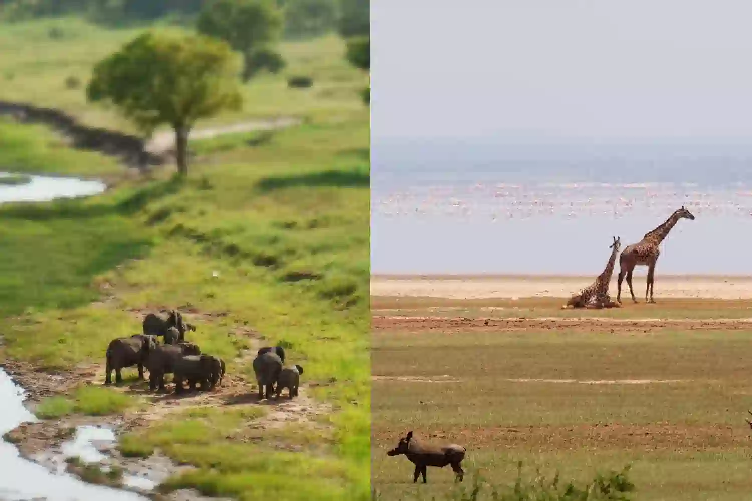
Parc national de Tarangire , couvrant environ 2 850 carrés kilomètres, est un vaste paysage de savane caractérisé par Acacia Woodlands, zones humides saisonnières, et la rivière Tarangire, qui sert de bouée de sauvetage pour La faune pendant la saison sèche. Ses baobabs emblématiques et ses plaines ouvertes créent un Expérience de safari dramatique et vaste.
Parc national du lac Manyara est beaucoup plus petit, couvrant environ 330 kilomètres carrés, avec environ les deux tiers de sa zone occupée par l'alcalin Lac Manyara. Le parc propose divers écosystèmes, y compris les eaux souterraines Les forêts, les bois d'Acacia et les plaines inondables herbeuses, toutes encadrées par la dramatique escarpement de la grande vallée du rift. Sa taille compacte offre encore un condensé Expérience de safari variée.
Faune
Parc national de Tarangire est réputé pour son éléphant massif Des troupeaux, qui comptent souvent par centaines, surtout pendant la saison sèche quand Les animaux se rassemblent le long de la rivière Tarangire. Le parc héberge également des lions, des léopards, Cheetahs, girafes, zèbres et diverses antilopes. Avec plus de 550 espèces d'oiseaux, Y compris le Starling cendré endémique et le monde à col de jaune, Tarangire est un Haven pour les ornithologues amateurs. Les rhinocéros sont rares, ce qui rend le «Big Five» complet moins probable.
Parc national du lac Manyara est célèbre pour son unique Lions d'escalade d'arbres, un comportement rare qui attire de nombreux visiteurs. Le parc est à la maison aux éléphants, aux hippopotames, aux girafes, aux zèbres et aux grands troupeaux de buffles. Le lac attire des milliers de flamantsos pendant la saison des pluies, créant un rose vibrant spectacle. D'autres espèces d'oiseaux, comme les pélicans et les cigognes, prospèrent ici, avec plus 400 espèces enregistrées. Bien que les léopards et les rhinocéros sont présents, ils sont plus difficiles à Spot, donc le complet Big Five n'est pas garanti.
Prix
Parc national de Tarangire a des frais d'entrée d'environ 50 $ à 60 $ par personne par jour, avec des frais de safari, y compris des guides et des transports, allant de 150 $ - 350 $ par personne et par jour, selon l'opérateur et la taille du groupe. C'est une plus grande taille peut augmenter les coûts de transport pour les safaris prolongés, mais il reste Globalement favorable à un budget.
Parc national du lac Manyara est légèrement moins cher, avec des frais d'entrée Environ 45 $ à 55 $ par personne et par jour. Les coûts de safari varient généralement de 120 $ à 300 $ par personne et par jour, ce qui en fait une excellente option pour les voyageurs à petit budget, Surtout pour les excursions d'une journée en raison de sa proximité avec Arusha et la taille compacte.
Options d'hébergement
Parc national de Tarangire offre une variété d'hébergement, de Lodges de luxe comme Tarangire Treetops et Sanctuary Swala Camp (400 $ - 900 $ par nuit) à des options de milieu de gamme comme Tarangire Safari Lodge (100 $ - 250 $ par nuit). Les voyageurs à petit budget peuvent choisir des campings publics ou privés, comme le camping Zion, À partir de 20 $ à 50 $ par personne par nuit. La grande taille du parc permet Options d'hébergement isolées.
Parc national du lac Manyara a moins d'options d'hébergement dû à sa taille plus petite, mais propose toujours une gamme. Lodges de luxe comme le lac Manyara Serena Safari Lodge et et Beyond Lake Manyara Tree Lodge coûtent 300 $ à 700 $ par nuit. Les options de milieu de gamme, telles que le camp de tente Migunga, varient de 80 $ à 200 $ par nuit. Les campings à petit budget, comme le camping Panorama, commencent à 20 $ à 40 $ par personne par nuit, souvent située près de l'entrée du parc pour plus de commodité.
Attractions
Parc national de Tarangire présente la rivière Tarangire, un aimant pour la faune pendant la saison sèche et le marécage Silale, un hotspot pour les oiseaux et les prédateurs. Ses anciens baobabs et ses vastes plaines créent un pittoresque Cadre, avec divers écosystèmes offrant des opportunités d'observation de la faune variées.
Parc national du lac Manyara centres autour du lac pittoresque Manyara, qui attire les flamants et autres oiseaux d'eau. La forêt des eaux souterraines Près de l'entrée du parc est idéal pour repérer les singes et les éléphants, tandis que le Hot Springs à Maji Moto et l'escarpement de Rift Valley offrent une superbe fond de fond. La disposition compacte du parc assure un accès rapide à sa clé attractions.
Expériences et activités
Parc national de Tarangire propose des lecteurs de jeu étendus, avec Options d'une journée ou d'une demi-journée pour explorer ses divers habitats. Marche guidée Les safaris offrent une expérience intime de brousse et certains opérateurs offrent la nuit Le jeu roule pour repérer des animaux nocturnes comme les léopards et les aardvarks. Culturel Les visites des villages à proximité de Maasai ou de Datoga ajoutent une dimension culturelle.
Parc national du lac Manyara excelle dans les lecteurs de jeux plus courts, Parfait pour les safaris d'une demi-journée ou d'une journée en raison de sa petite taille. Unique Les activités comprennent des visites de passerelles à travers la forêt des eaux souterraines, l'offre Une perspective de la cime des arbres et des tournées à vélo le long des sentiers de parc désignés. Culturel Les visites au village de Mto Wa Mbu à proximité donnent un aperçu des traditions locales, et L'observation des oiseaux est un moment fort, surtout pendant la saison des pluies.
Accessibilité
Parc national de Tarangire est situé à environ 120 kilomètres de Arusha, une route de 2 heures sur des routes bien entretenues, ce qui le rend très accessible pour Des excursions d'une journée ou des safaris plus longs. Un véhicule 4x4 standard est suffisant et le parc a moins de restrictions de permis par rapport à d'autres destinations.
Parc national du lac Manyara est encore plus proche, à seulement 80 kilomètres d'Arusha, à environ 1,5 heure de route, ce qui en fait l'un des parcs les plus accessibles dans le circuit nord. Sa proximité et sa petite taille le rendent idéal pour Visites, avec de bonnes routes et un accès facile via des véhicules 4x4.
Meilleur moment pour visiter
Parc national de Tarangire est le meilleur pendant la saison sèche (juin à Octobre), lorsque la faune se rassemble autour de la rivière Tarangire, offrant observations spectaculaires. La saison des pluies (novembre à mai) est idéale pour L'observation des oiseaux et les paysages luxuriants, bien que certaines zones puissent être moins accessibles en raison de pluie.
Parc national du lac Manyara est excellent toute l'année La saison (novembre à mai) est idéale pour voir les flamantsie et autres migratoires Oiseaux, avec une verdure luxuriante améliorant le paysage. La saison sèche (juin à Octobre) offre de meilleures conditions routières et des mammifères plus visibles, bien que le lac peut rétrécir.
Foule
Parc national de Tarangire est moins bondé que les parcs plus célèbres Comme Ngorongoro, offrant une expérience de safari tranquille. Sa grande taille se disperse la circulation des véhicules, même pendant la saison sèche de pointe (juin à septembre), offrant un sentiment de solitude.
Parc national du lac Manyara voit des foules modérées, en particulier Pendant la haute saison, en raison de sa popularité pour les excursions d'une journée d'Arusha. C'est petit La taille peut rendre les véhicules plus concentrés, mais il est généralement moins occupé que Ngorongoro, offrant une expérience relativement paisible.
FAQ sur Tarangire vs Lake Manyara National Park
Quel parc est le meilleur pour la vision de la faune?
Tarangire est idéal pour voir de grands troupeaux d'éléphants et une vie d'oiseaux diversifiée, Surtout pendant la saison sèche. Le lac Manyara est réputé pour l'escalade des arbres les lions, les flamantsos et un écosystème compact et diversifié, le rendant idéal pour un rapide safari.
Tarangire ou lac Manyara est-il plus favorable à un budget?
Les deux parcs sont relativement abordables, mais le lac Manyara est légèrement moins cher en raison de Frais d'entrée inférieurs et son aptitude aux excursions d'une journée. La plus grande taille de Tarangire peut Augmenter les coûts de transport pour les safaris prolongés.
Quel parc est le meilleur pour un courte visite?
Le lac Manyara est meilleur pour les visites courtes en raison de sa petite taille et de sa proximité Arusha, ce qui le rend parfait pour un safari d'une demi-journée ou d'une journée. Tarangire est plus grand La taille convient à des explorations plus longues.
Puis-je combiner les deux parcs en un safari?
Oui, Tarangire et le lac Manyara sont proches les uns des autres et une partie de la Tanzanie Circuit de safari du Nord, ce qui les rend faciles à combiner dans un itinéraire de plusieurs jours, Souvent avec Serengeti ou Ngorongoro.
Réflexions finales
Choisir entre Tarangire PARC National et Lac Parc National de Manyara dépend de vos objectifs de safari. Tarangire est parfait pour ceux qui recherchent un vaste safari tranquille avec des troupeaux d'éléphants massifs, une vie d'oiseaux diversifiée et des activités comme la marche safaris et entraînements nocturnes. Son abordabilité et ses vastes paysages le font Idéal pour les expériences immersives. Lac Manyara est le go-to pour Un safari rapide et vibrant avec des attractions uniques comme les lions d'escalade, Les flamants et les promenades à baldaquin, le tout dans un parc compact et accessible. Les deux sont à petit budget et proche d'Arusha, ce qui les rend faciles à combiner pour un Aventure complète du circuit du Nord. Que vous choisissiez Tarangire Savanas tentaculaires ou divers écosystèmes de Manyara, promettent tous deux inoubliables Mémoires post-kilimanjaro.