Zanzibar vs Mombasa | Destinasi pantai pantai teratas
Zanzibar , Tanzanian Archipelago, dan Mombasa, hab pantai Kenya, adalah dua pantai utama Afrika Timur Destinasi, masing -masing menawarkan pasir putih, air biru, dan budaya yang bersemangat. Sementara kedua -duanya Menyediakan pelarian tropika, mereka berbeza dalam atmosfera, aktiviti, dan aksesibiliti. Ini Perbandingan meneroka pantai, kos, penginapan, aktiviti, budaya, kebolehcapaian, yang terbaik Masa untuk melawat, dan bergetar untuk membantu anda memilih percutian pantai yang ideal.
Zanzibar vs Mombasa: Saman Permata Pantai mana Anda?
Pesona Pulau Zanzibar dan Warisan Swahili Berbeza dengan Mombasa's Bustling Pantai Bandar dan Kedalaman Sejarah. Sama ada anda mencari percutian pulau yang tenang atau bandar pantai yang meriah dengan akses safari yang mudah, panduan ini menyoroti kunci perbezaan untuk memberitahu keputusan anda.
Pantai
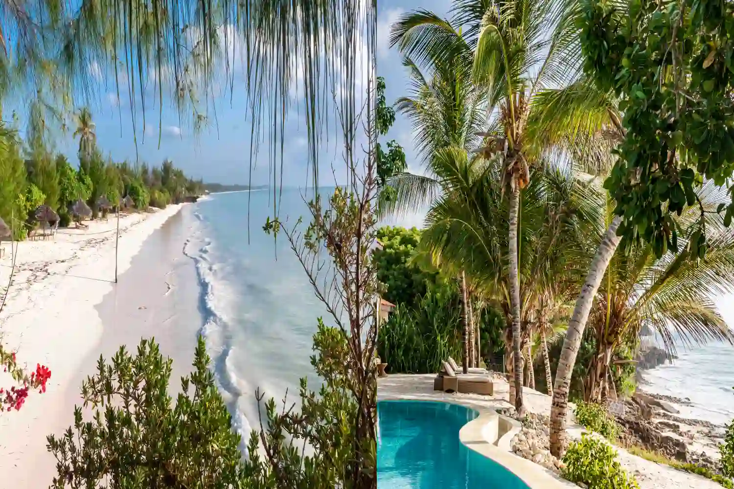
Zanzibar terkenal dengan pantai murni seperti Nungwi, Kendwa, dan Paje, yang menampilkan pasir putih serbuk dan perairan biru. Tidal Variasi mempengaruhi berenang pada masa -masa, tetapi terumbu karang di sekitar tawaran Atoll Mnemba luar biasa snorkeling dan menyelam.
Mombasa menawarkan pantai yang indah seperti Diani, Nyali, dan Bamburi, dengan pasir putih lembut dan perairan lautan India yang hangat. Pantai Diani terutamanya Terkenal dengan peregangan yang panjang dan tidak terhitung dan air yang jelas, sesuai untuk berenang dan sukan air.
Harga
Zanzibar mempunyai kos harian $ 50- $ 200 seorang. Belanjawan Penginapan bermula pada $ 20- $ 50 setiap malam, jarak pertengahan pada $ 80- $ 150, dan kemewahan Resorts seperti Zuri Zanzibar pada $ 300- $ 600. Makanan berkisar dari $ 5- $ 20, dan aktiviti Seperti kos snorkeling $ 20- $ 50.
Mombasa sedikit lebih mesra bajet, dengan kos harian $ 40- $ 150 seorang. Hotel bajet dan rumah tamu bermula pada $ 15- $ 40 setiap malam, Mid-range pada $ 50- $ 120, dan pusat peranginan mewah seperti Serena Beach Resort pada $ 150- $ 400. Makanan berharga $ 3- $ 15, dan aktiviti berkisar dari $ 15- $ 40.
Pilihan Penginapan
Zanzibar menawarkan pelbagai penginapan, dari rumah tamu bajet seperti Mnarani Beach Cottages ($ 30- $ 80) ke hotel butik di bandar batu seperti Emerson Pada Hurumzi ($ 100- $ 200) dan resort mewah seperti Baraza ($ 400- $ 800). Pulau Lokasi memberikan rasa terpencil.
Mombasa mempunyai pelbagai pilihan, dari hotel pantai bajet seperti Kahama Hotel ($ 20- $ 50) hingga hartanah jarak pertengahan seperti Voyager Beach Resort ($ 80- $ 150) dan tetap mewah seperti Sarova Whitesands ($ 150- $ 350). Bandarnya Menetapkan menawarkan akses mudah ke kemudahan bandar.
Aktiviti
Zanzibar cemerlang dalam aktiviti air seperti menyelam di mnemba atoll ($ 50- $ 100), snorkeling ($ 20- $ 50), dan kite-surfing di paje. Pilihan berasaskan tanah Sertakan SPICE Tours ($ 20- $ 40), Stone Town Cultural Walks ($ 15- $ 30), dan Jozani Hutan Lawatan ($ 10- $ 20).
Mombasa menawarkan sukan air seperti snorkeling, menyelam ($ 40- $ 80), dan Jet-skiing ($ 30- $ 60) di sepanjang pantai Diani dan Nyali. Aktiviti tanah termasuk Fort Jesus Tours ($ 5- $ 10), Eksplorasi Bandar Lama Mombasa, dan Perjalanan Hari ke Berdekatan Tsavo atau Shimba Hills Parks ($ 50- $ 100).
Budaya
Zanzibar penuh dengan budaya Swahili, dengan Batu Bandar Lorong-lorong yang disenaraikan oleh UNESCO yang mempamerkan pengaruh Arab, India, dan Afrika. Ladang rempah, tunggangan bot dhow, dan persembahan muzik taarab menyediakan kaya perendaman budaya.
Mombasa menggabungkan sejarah swahili dan kolonial, dengan Fort Yesus dan Old Town yang mencerminkan pengaruh Portugis dan Arab. Pasarannya yang cergas, tempatan Masakan seperti biryani, dan perayaan pantai menawarkan kedalaman budaya, walaupun ia Merasa lebih banyak bandar daripada Zanzibar.
Kebolehcapaian
Zanzibar dicapai melalui Abeid Amani Karume International Lapangan terbang, dengan penerbangan dari Dar es Salaam (20 minit, $ 50- $ 100) atau Nairobi ($ 150- $ 300). Feri dari Dar es Salaam mengambil masa 2 jam ($ 35- $ 50). Kos visa $ 50- $ 100 pada ketibaan untuk kebanyakan kebangsaan.
Mombasa boleh diakses melalui Lapangan Terbang Antarabangsa MOI, dengan langsung Penerbangan dari Nairobi (1 jam, $ 50- $ 150) atau hab antarabangsa seperti Addis Ababa atau Dubai ($ 200- $ 500). Akses jalan dari Nairobi (6-8 jam) atau kereta api (4-5 jam, $ 10- $ 30) juga pilihan. Kenya Visa berharga $ 50 pada ketibaan.
Masa terbaik untuk melawat
Zanzibar adalah yang terbaik dari bulan Jun-Oktober dan Disember-Februari, dengan Cuaca kering dan suhu 25-30 ° C. Hujan pendek (November) dan hujan panjang (March-Mei) membawa kelembapan tetapi kos yang lebih rendah dan lebih sedikit orang ramai.
Mombasa berkongsi iklim yang sama, dengan keadaan ideal dari Jun-Oktober dan Disember-Februari (25-32 ° C). Musim hujan (April-Mei dan November) menawarkan harga yang lebih rendah tetapi mandi sekali -sekala dan kelembapan yang lebih tinggi.
Getaran
Zanzibar mempunyai getaran syurga pulau, menggabungkan pantai yang tenang dengan pengalaman budaya yang bersemangat. Suasana santai yang sesuai dengan pelancong Mencari relaksasi dan perendaman Swahili yang sah dari kesibukan bandar.
Mombasa menawarkan getaran bandar yang meriah, dengan sibuk Pasaran, kehidupan malam, dan akses mudah ke kedua -dua pantai dan kehidupan bandar. Ia merayu kepada Mereka yang menikmati campuran kelonggaran pantai dan penerokaan bandar.
Soalan Lazim Mengenai Zanzibar vs Mombasa
Yang lebih mesra bajet, Zanzibar atau Mombasa?
Mombasa pada umumnya lebih mesra bajet, dengan penginapan yang lebih rendah dan makan kos. Zanzibar boleh menjadi berpatutan tetapi mempunyai pilihan mewah yang pricier.
Yang Destinasi menawarkan lebih banyak pengalaman budaya?
Zanzibar menawarkan pengalaman budaya yang lebih kaya dengan warisan dan batu Swahili Bandar. Mombasa mempunyai kedalaman budaya tetapi lebih fokus di bandar.
Yang Lebih baik untuk sukan air dan aktiviti?
Zanzibar mempunyai kelebihan untuk menyelam dan snorkeling kerana terumbu karangnya, sementara Mombasa menawarkan sukan air yang serupa tetapi cemerlang di bandar dan bersejarah lawatan.
Bolehkah saya menggabungkan Zanzibar dan Mombasa dalam satu perjalanan?
Ya, menggabungkan Zanzibar dan Mombasa boleh dilaksanakan melalui penerbangan pendek (1 jam, $ 100- $ 200) atau feri, menjadikannya mudah untuk menikmati kedua-dua destinasi dalam satu perjalanan.
Pemikiran terakhir
Pilihan anda antara Zanzibar dan Mombasa Bergantung pada pilihan dan bajet perjalanan anda. Zanzibar sangat sesuai untuk mereka mencari pulau melarikan diri dengan budaya swahili yang kaya, pantai murni, dan Menyelam bertaraf dunia, sesuai untuk percutian yang tenang namun mencabar. Saman Mombasa Pelancong yang menikmati bandar pesisir yang bersemangat dengan penginapan yang berpatutan, aktiviti yang pelbagai, dan akses mudah ke destinasi safari Kenya. Kedua -dua tawaran Pengalaman pantai Afrika Timur yang menakjubkan, tetapi Zanzibar bersandar ke arah tenang Keaslian, sementara Mombasa menyampaikan campuran bandar-bandar yang meriah dan boleh diakses.