Семь саммитов | Самые высокие вершины на каждом континенте
Семь саммитов представляют собой окончательный вызов альпинизма, включающий самые высокие вершины на каждом из семи континентов. Основываясь на списке Messner, это руководство сравнивает Mount Everest, Aconcagua, Denali, Kilimanjaro, Mount Elbrus, Mount Vinson и Puncak Jaya по высоте, расположение, Сложность, продолжительность, стоимость и проблемы, помогая вам спланировать ваше приключение с Jaynevy Tours, Особенно для Килиманджаро.
Семь вершин: квест альпинизма
От возвышающихся высот Эвереста до Управый Килимана Доступные следы, семь саммитов предлагают разнообразные проблемы для альпинистов. Это сравнение, используя список Месснера (puncak Jaya Over Kosciuszko), выделяет ключевые факторы, направляющие ваше путешествие.
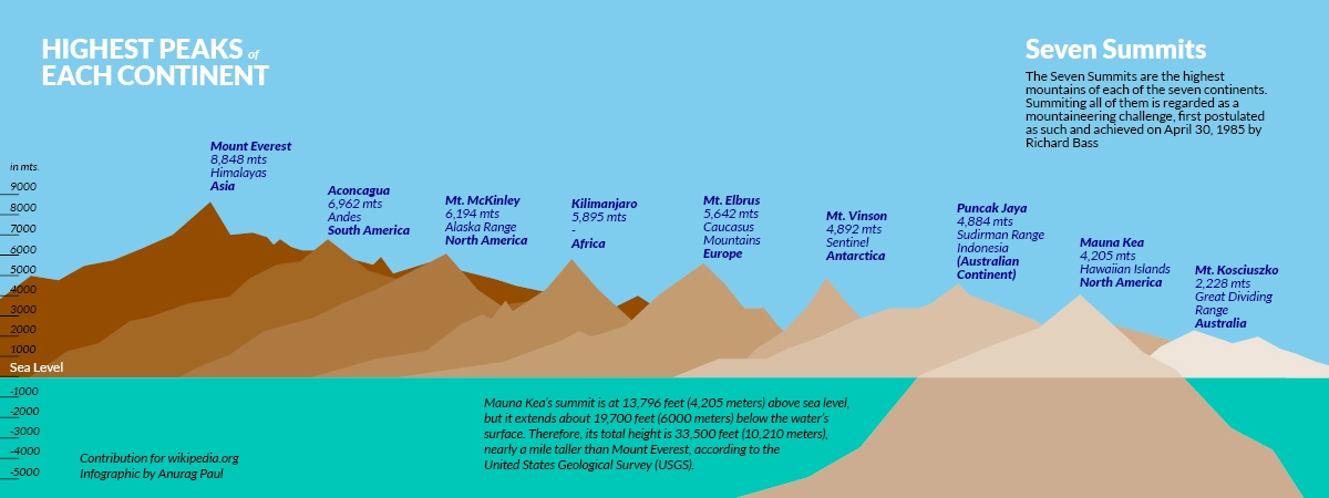
Сравнение семи саммитов
| Пик | Континент | Высота | Расположение | Сложность | Продолжительность | Стоимость (USD) | Ключевые проблемы |
|---|---|---|---|---|---|---|---|
| Гора Эверест | Азия | 8 848,86 м (29 031,7 фута) | Непал/Китай | Экстремальный (технический, высокая высота) | 6-8 недель | 50 000-100 000 долларов | Высота, лавины, icumbu Icefall, погода |
| Aconcagua | Южная Америка | 6 960 м (22 837 футов) | Аргентина | Умеренный (нетехнический, высота) | 2-3 недели | 5000-15 000 долларов | Высота, холодный, сильный ветер |
| Денали | Северная Америка | 6 190 м (20 310 футов) | Аляска, США | Высокий (холодный, технический) | 2-3 недели | 10 000-20 000 долларов | Тяжелый простуда, штормы, носят нагрузки |
| Килиманджаро | Африка | 5 895 м (19 341 футов) | Танзания | Умеренный (нетехнический, высота) | 5-9 дней | От 2000 до 10 000 долларов | Высокая болезнь, быстрое восхождение |
| Гора Эльбрус | Европа | 5642 м (18 510 футов) | Россия | Умеренный (технический, холодный) | 7-10 дней | 4000-10 000 долларов | Холодно, погода меняется |
| Гора Винсон | Антарктида | 4892 м (16 050 футов) | Антарктида | Высокий (холод, логистика) | 2-3 недели | 40 000-50 000 долларов | Экстремальная холода, удаленность, стоимость |
| Puncak Jaya | Австралия/Океания | 4884 м (16 024 фута) | Папуа, Индонезия | Экстремальный (технический, удаленный) | 10-14 дней | 15 000-30 000 долларов | Скалолазание, доступ к джунглям, нестабильность |
Ключевые идеи
Гора Эверест это окончательная задача с самой высокой высота, значительные технические требования и самая высокая стоимость, требуя 6-8 недели и обширная подготовка. Килиманджаро , расположен в Танзания, наиболее доступная, предлагая нетехнический путь, достижимый в 5-9 дней, идеально подходит для начинающих с умеренной фитнесом. Пункак Джая выделяется своим техническим скалолазанием и удаленными джунглями доступ, пока Гора Винсон логистически сложно из -за его антарктическое местоположение и высокие затраты на экспедицию.
Примечание : Список Messner, используемый здесь, включает в себя Puncak Jaya для Австралия/Океания за его большую задачу. Список басов заменяет крепление Костюшко (2228 м, Австралия), нетехнический день, который меньше требовательный.
Планируя путешествие на семь верхов
Проблема Seven Summits была впервые завершена Патриком Морроу в 1986 году (Список Месснера), с самым быстрым завершением Маши Гордон за 126 дней (2016). Затраты варьируются от 2000 долларов США для Килиманджаро до более 100 000 долларов США для Эвереста или Винсона. Риски включают высокую болезнь, экстремальную погоду и технические трудности. Новички должны начать с Килиманджаро или Эльбруса, в то время как опытные альпинисты может нацелиться на Денали, Эверест или Пункак Джая за их технические и материально -технические проблемы.
Для тех, кто заинтересован в скалолазании Килиманджаро Jaynevy Tours предлагает адаптированные бюджетные и роскошные пакеты, в том числе такие маршруты, как Machame или Марангу, с профессиональными гидами и комплексной поддержкой. Свяжитесь с нами, чтобы спланировать Ваше килиманджаро восхождение или другие альпинистские приключения.
Часто задаваемые вопросы о семи саммитах
Какие семь саммитов?
Семь вершин - самые высокие пики на каждом из семи континентов, Альпинирирование вызовет вызов всех из них, как правило, следуя за месснером список.
Какой самый простой семи саммит поднимается?
Килиманджаро-самый простой, нетехнический путь, достижимый за 5-9 дней, Идеально подходит для начинающих с умеренной фитнесом.
Что самое тяжелое семь Саммит, чтобы подняться?
Маунт Эверест самый сложный из -за его крайней высоты, технического лазания и непредсказуемая погода, требующая 6-8 недель и значительный опыт.
Могу ли я начать с Kilimanjaro для вызова Seven Summits?
Да, Килиманджаро-отличная отправная точка из-за его нетехнической природы, Более короткая продолжительность и более низкая стоимость. Свяжитесь с Jaynevy Tours для индивидуального килиманджаро пакеты.