Ngorongoro Krater Vs Lake Manyara | En iyi Tanzanya Safari Destinasyonlar
Heyecan verici bir tırmanıştan sonra Taklmak Kilimanjaro , Tanzanya’nın kuzey devresindeki bir safari, devam etmenin harika bir yoludur. macera. Ngorongoro Krater Ve Örgü Manyara Milli Parkı , her iki ikonik destinasyon, farklı safari deneyimleri sunar farklı gezgin tercihlerine göre uyarlanmıştır. Bu makale, ikisini doğaya göre karşılaştırıyor. Park, yaban hayatı, fiyat, konaklama seçenekleri, cazibe merkezleri, deneyimler ve aktiviteler, Erişilebilirlik, ziyaret etmek için en iyi zaman ve mükemmel olanı seçmenize yardımcı olacak kalabalık seviyeleri Kilimanjaro Safari sonrası.
Ngorongoro Crater Vs Lake Manyara: Hangisi için Sen?
Ngorongoro Crater ve Lake Manyara Milli Parkı, göze çarpan destinasyonlar Tanzanya’nın Kuzey Safari Devresi, her biri benzersiz manzaralar ve Yaban hayatı deneyimleri. Yüksek yoğunluklu bir yaban hayatı arıyor olun Volkanik bir kalderada gösteri veya ağaç tırmanma aslanları ile kompakt bir park Ve canlı kuş hayatı, bu rehber size yardımcı olmak için temel farklılıkları yıkıyor İdeal Safari hedefini seçin.
Parkın doğası
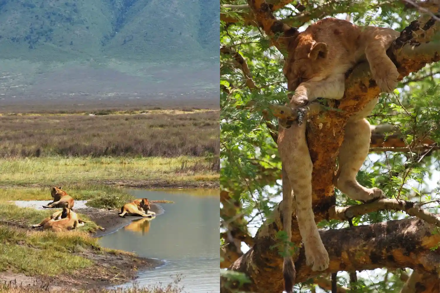
Ngorongoro krater UNESCO Dünya Mirası Sitesi ve Yaklaşık 260 kilometrekarelik dünyanın en büyük sağlam volkanik kalderaları. “Cennet Bahçesi” olarak bilinen, çevrili yemyeşil bir krater tabanına sahiptir. Dik duvarlar, otlaklar, bataklıklar ile bağımsız bir ekosistem yaratma, Ormanlar ve kompakt ama nefes kesici bir safari deneyimi sunan bir soda gölü.
Lake Manyara Milli Parkı , yaklaşık 330 kareyi kapsıyor kilometreler, alkalin gölü Manyara'nın egemen olduğu daha küçük bir parktır, bölgesinin yaklaşık üçte ikisini kaplar. Park, çeşitli ekosistemlere sahiptir, Yeraltı suyu ormanları, akasya ormanlık alanları ve çimenli taşkın yatakları dahil, hepsi Dramatik Great Rift Valley yükselişine karşı, henüz yoğunlaşmış bir Çeşitli safari deneyimi.
Vahşi yaşam
Ngorongoro krater yüksek vahşi yaşam yoğunluğu ile ünlüdür, Kapalı bölgesinde 25.000'den fazla hayvana ev sahipliği yapmak. En iyilerinden biri tespit edilecek yerler Buyuk Bükülme ( Aslanlar - Leoparlar - Dolgu - Mandalar - Ve Gergedan ). Krater, büyük aslanlar, sırtlanlar, zebralar, vahşi doğa popülasyonlarına ev sahipliği yapıyor, ve kritik tehlike altındaki siyah gergedan. Flamingolar ve diğer kuşlar Sık sık kraterin benzersiz ekosistemi tarafından desteklenen soda gölü.
Lake Manyara Milli Parkı ağaç tırmanışı ile ünlüdür Aslanlar, birçok ziyaretçiyi çeken nadir bir davranış. Park fillere ev sahipliği yapıyor, Suaygırları, zürafalar, zebralar ve büyük manda sürüleri. Göl binlerce çekiyor Islak mevsimde flamingolar, canlı bir pembe gösteri yaratarak Pelikan ve leylekler de dahil olmak üzere 400'den fazla kuş türü. Leoparlar ve gergedanlar Mevcut, tespit etmek daha zordur, büyük beşi daha az olası hale getirir.
Fiyat
Ngorongoro krater daha yüksek olan premium bir safari varış noktasıdır Ngorongoro koruma alanındaki koruma ücretleri nedeniyle maliyetler. Giriş Ücretleri kişi başı yaklaşık 70 $-80 $, ayrıca bir araç ücreti ve bir krater Araç başına yaklaşık 200 $-300 $ hizmet ücreti. Kılavuzlar dahil Safari maliyetleri ve nakliye, genellikle kişi başına 250-500 dolar arasında değişir, Tur operatörü ve grup boyutu.
Lake Manyara Milli Parkı girişle daha bütçe dostu Ücretler kişi başına günlük 45-55 dolar civarında. Oyun sürücüleri dahil safari maliyetleri ve Kılavuzlar, kişi başı 120-300 $ arasında değişen ve uygun fiyatlı bir seçenek haline getirir, Özellikle Arusha'ya yakınlığı nedeniyle günlük geziler için.
Konaklama Seçenekleri
Ngorongoro krater Öncelikle konaklama birimleri sunar Krater jant, doğal manzaraları en üst düzeye çıkarır. Ngorongoro Serena Safari gibi lüks localar Lodge ve andbeyond ngorongoro krater Lodge, üst düzey olanaklar ve Çarpıcı manzaralar, gecelik 300-800 dolar. Orta menzilli seçenekler, örneğin Ngorongoro Sopa Lodge, gecelik 150-300 dolar arasında değişiyor. Bütçe gezginleri kalabilir Simba Campsite gibi halka açık kamp alanlarında, kişi başına 30-50 $ 'dan başlayan gece.
Lake Manyara Milli Parkı çünkü daha az konaklama seçeneği var daha küçük boyutta, ancak sağlam bir menzil sunuyor. Lake Manyara Serena gibi lüks localar Safari Lodge ve Andbeyond Lake Manyara Tree Lodge, gecelik 300-700 dolar. Migunga Tented Camp gibi orta menzilli seçenekler, gecelik 80-200 $ arasında değişiyor. Panorama kamp alanı gibi bütçe kampları, kişi başı 20-40 $ 'dan başlıyor, Genellikle park girişinin yakınında elverişli bir konuma sahiptir.
Cazibe merkezleri
Ngorongoro krater kraterle tekil bir cazibe Ana çekiliş olarak. Önemli noktalar arasında Lerai Ormanı, Lush Acocia vahşi yaşamla dolu ormanlık; Magadi Gölü, Sık sık yapılan bir soda gölü flamingolar; ve gorigor bataklığı, suaygırları ve kuşlar için bir sıcak nokta. Krater Kompakt boyut, sık, yakın çekim vahşi yaşam manzaralarını sağlar.
Lake Manyara Milli Parkı doğal gölün etrafındaki merkezler Flamingoları ve diğer su kuşlarını çeken Manyara. Yeraltı suyu ormanı Park girişinin yakınında, maymunları ve filleri tespit etmek için idealdir, Maji Moto ve Rift Valley yükselişinde kaplıcalar çarpıcı sağlar arka plan. Parkın kompakt düzeni, anahtarına hızlı erişim sağlar cazibe merkezleri.
Deneyimler ve Aktiviteler
Ngorongoro krater Krater içinde klasik oyun sürücüleri sunar, Koruma düzenlemeleri nedeniyle tipik olarak 4-6 saat süren süreyi sınırlayan Krater zemin. Güdümlü yürüyüş safarileri daha geniş Ngorongoro'da mevcuttur Koruma alanı ve Masai köylerine kültürel ziyaretler Yerel gelenekler. Kişi başı yaklaşık 500-600 $ 'a mal olan sıcak hava balonu safarileri, Kraterin benzersiz bir hava perspektifini sağlayın.
Lake Manyara Milli Parkı Kısa oyun sürücülerinde mükemmel, ideal Küçük boyutu nedeniyle yarım gün veya tam günlük safariler için. Benzersiz etkinlikler Treetop manzarası için yeraltı suyu ormanından kanopi geçidi turlarını ekleyin ve belirlenmiş parkurlar boyunca bisiklet turları. Yakındaki MTO WA MBU'ya kültürel ziyaretler Köy kültürel bir bağlantı sağlar ve kuş gözlemleme bir vurgudur, Özellikle ıslak mevsimde.
Erişilebilirlik
Ngorongoro krater Arusha'dan yaklaşık 180 kilometre uzaklıkta yer almaktadır. 3-4 saatlik sürüş çoğunlukla asfalt yollarda, nispeten erişilebilir hale getirir. Bu bir kısım Kuzey Safari devresinden, ancak krater tabanına erişim 4x4 gerektirir araçlar ve izinler, lojistik karmaşıklık eklemek.
Lake Manyara Milli Parkı son derece erişilebilir, sadece 80 Arusha'dan kilometre, iyi yollarda yaklaşık 1,5 saatlik bir sürüş. Yakınlığı ve Küçük beden, standart 4x4 üzerinden kolay erişim ile hızlı ziyaretler için mükemmel hale getirir araçlar ve minimum izin kısıtlamaları.
Ziyaret etmek için en iyi zaman
Ngorongoro krater çünkü yıl boyunca bir hedef Tutarlı yaban hayatı varlığı. Kuru Sezon (Haziran - Ekim) oyun için idealdir Hayvanlar olarak görüntüleme su kaynakları etrafında toplanır. Islak mevsim (Kasım - Mayıs) yemyeşil yeşillikler ve daha az kalabalık sunar, ancak bazı yollar çamurlu olabilir.
Lake Manyara Milli Parkı ıslak olan yıl boyunca mükemmel Sezon (Kasım -Mayıs) flamingolar ve göçmen kuşlar için en iyisi olmak, Yemyeşil manzara ile tamamlanmıştır. Kuru Sezon (Haziran - Ekim) daha iyi sağlar Gölün küçülmesine rağmen, yol koşulları ve daha görünür memeliler.
Kalabalık
Ngorongoro krater Tanzanya’nın en popüler safarlarından biridir Özellikle en yüksek kuru sırasında önemli kalabalıklar çeken destinasyonlar Sezon (Haziran - Eylül). Küçük boyutu konsantre araca yol açabilir Bazı gezginler için vahşi yaşam duygusunu azaltabilecek trafik.
Lake Manyara Milli Parkı ılımlı kalabalıklar, özellikle Yoğun mevsim boyunca, günlük geziler için popülaritesi nedeniyle. Daha küçük boyutu Araçları daha yoğun hissettirir, ancak genellikle daha az meşgul Ngorongoro, nispeten huzurlu bir deneyim sunuyor.
Ngorongoro Crater Vs Lake Manyara Milli Parkı Hakkında SSS
Hangi Park Big Beş'i görmek için daha mı iyi?
Ngorongoro krateri, tüm Big Beş'i tespit etmek için daha iyi bir seçimdir, Yüksek vahşi yaşam yoğunluğu nedeniyle nadir siyah gergedan dahil. Göl Manyara, ağaç tırmanma aslanları ve diğer vahşi yaşam sunuyor, ancak gergedan veya leopar manzaralarını sağlayın.
Ngorongoro mu yoksa Manyara Gölü Daha fazla bütçe dostu mu?
Manyara Gölü, daha düşük giriş ücretleri ve uygunluğu nedeniyle daha bütçe dostudur Günlük geziler için. Ngorongoro’nun daha yüksek ücretleri ve premium konaklama yerleri daha fazla masraflı.
Kısa bir ziyaret için hangi park daha iyidir?
Manyara Gölü, Arusha ve Compact'a yakınlığı nedeniyle kısa ziyaretler için idealdir. Boyut, yarım gün veya tam günlük safari için mükemmel. Ngorongoro daha fazla zaman gerektirir Seyahat ve izin gereksinimleri nedeniyle.
Her iki parkı da birleştirebilir miyim safari?
Evet, her iki park da Tanzanya’nın Kuzey Safari Devresinin bir parçası ve kolayca olabilir çok günlük bir güzergahta, genellikle Serengeti veya Tarangire ile birlikte.
Son Düşünceler
Aralarında Seçim Ngorongoro Krater Ve Örgü Manyara Milli Parkı Safari önceliklerinize bağlıdır. Ngorongoro Krater kompakt, yüksek yoğunluklu bir yaban hayatı arayan gezginler için idealdir Çarpıcı bir kalderada büyük beşi tespit etme şansı olan deneyim Daha yüksek maliyetlere ve kalabalığa rağmen ayar. Manyara Lake National Park bütçe dostu, hızlı bir safari isteyenler için mükemmeldir Ağaç tırmanışı aslanları, flamingolar ve gölgelik gibi benzersiz cazibe merkezleriyle içeri girer Kompakt, erişilebilir bir park. Her ikisi de Tanzanya’nın kuzey devresinin bir parçası Kapsamlı bir safari macerası için birleştirmek kolaydır. Seçip seçmeni İkonik krater veya Manyara'nın canlı ekosistemleri, her ikisi de söz Unutulmaz Kilimanjaro deneyimleri.