Ngorongoro Crater vs Tarangire Milli Parkı | En iyi Tanzanya Safari Hedefleri
Heyecan verici bir tırmanıştan sonra Taklmak Kilimanjaro Tanzanya'daki bir safari, maceranıza devam etmenin mükemmel bir yoludur. İkisi Ülkenin en ikonik safari destinasyonları, Ngorongoro Krater Ve Targe Milli Park , farklı gezgin tercihlerine hitap eden farklı deneyimler sunar. Bu makale ikisini parkın doğasına göre karşılaştırıyor, vahşi yaşam, fiyat, konaklama Seçenekler, cazibe merkezleri, deneyimler ve aktiviteler, erişilebilirlik, ziyaret etmek için en iyi zaman ve kalabalık Kilimanjaro sonrası yolculuğunuza hangi hedefe karar vermenize yardımcı olacak seviyeler.
Ngorongoro Crater vs Tarangire Milli Parkı: Hangi Senin için doğru mu?
Ngorongoro Crater ve Tarangire Milli Parkı, Tanzanya'nın mücevherleri Her biri benzersiz manzaralar ve vahşi yaşam sunan Kuzey Safari Pisti deneyimler. İster kompakt, yüksek yoğunluklu bir yaban hayatı arıyor olun Macera veya büyük fil sürüleri olan genişleyen bir savan, bu kılavuz Mükemmel olanı seçmenize yardımcı olmak için temel farklılıkları yıkar Kilimanjaro Safari Hedef sonrası.
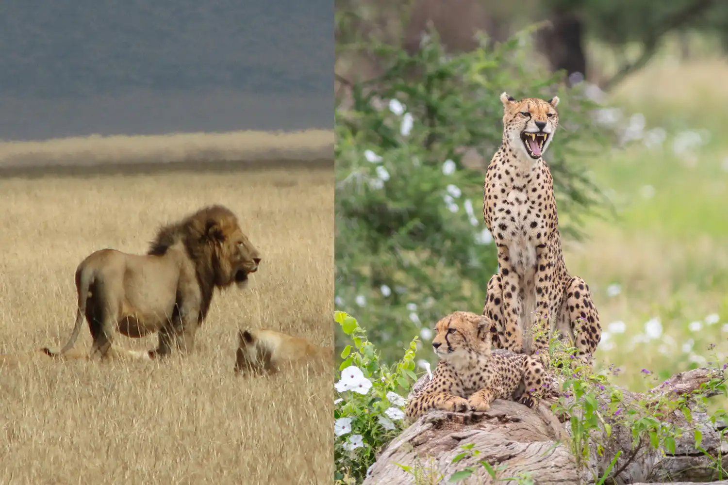
Parkın doğası
Ngorongoro krater UNESCO Dünya Mirası Sitesi ve Genellikle “bahçesi olarak adlandırılan dünyanın en büyük sağlam volkanik kalderaları Eden. " Yaklaşık 260 kilometrekarelik bir Dik duvarlarla çevrili yemyeşil krater zemini, benzersiz, bağımsız bir ekosistem. Kraterin çeşitli manzaraları arasında otlaklar, bataklıklar, ormanlar, ve kompakt ama nefes kesen bir safari deneyimi sunan bir soda gölü.
Tarangire Milli Parkı , yaklaşık 2.850 kareyi kapsıyor Kilometre, Acacia Woodlands, mevsimsel olarak hakim olan geniş bir savan manzarasıdır. Sulak alanlar ve vahşi yaşam için bir yaşam çizgisi görevi gören Tarangire Nehri Özellikle kuru mevsimde. İkonik baobab ağaçlarıyla tanınan ve açık Plains, Tarangire daha geniş ve sağlam bir safari deneyimi sunuyor kraterin kapalı ortamına.
Vahşi yaşam
Ngorongoro krater yüksek vahşi yaşam yoğunluğu ile ünlüdür kapalı bir alanda, onu tespit etmek için en iyi yerlerden biri haline getirir Buyuk Bükülme ( Aslanlar - Leoparlar - Dolgu - Mandalar - Ve Gergedan ). Krater, büyük aslan popülasyonları da dahil olmak üzere 25.000'den fazla hayvana ev sahipliği yapıyor, sırtlanlar, zebralar, antiloplar ve kritik tehlike altındaki siyah gergedan. Flamingolar Soda Gölü'nü sık sık ve kraterin benzersiz ekosistemi bir Kuş yaşamı çeşitliliği.
Tarangire Milli Parkı büyük filiyle ünlüdür Sürüler, bazen yüzlerce numarada, özellikle kuru mevsimde Hayvanlar Tarangire Nehri çevresinde toplandığında. Park ayrıca aslanlara ev sahipliği yapıyor, leoparlar, çitalar, zürafalar, zebralar ve çeşitli antiloplar. Tarangire bir Endemik Asy de dahil olmak üzere 550'den fazla kuş türüne sahip Birdwatcher’ın Cenneti Starling ve sarı yakalı muhabbet kuşu. Tüm büyükleri garanti etmeyebilir Beş (gergedanlar nadirdir), fil popülasyonları ve çeşitli kuş hayatı göze çarpan özellikler.
Fiyat
Ngorongoro krater statüsü nedeniyle daha pahalı olma eğilimindedir premium bir safari varış yeri ve ile ilişkili koruma ücretleri Ngorongoro Koruma Alanı. Giriş ücretleri kişi başı yaklaşık 70 $-80 $ 'dır Günde, artı bir araç ücreti ve krater hizmet ücreti yaklaşık 200-300 $ araç. Kılavuzlar ve nakliye dahil Safari maliyetleri tipik olarak Tur operatörüne ve grup büyüklüğüne bağlı olarak kişi başı 250-500 $.
Tarangire Milli Parkı genellikle daha bütçe dostudur Giriş ücretleri kişi başına günlük 50-60 dolar civarında. Oyun dahil safari maliyetleri Sürücüler ve kılavuzlar, kişi başı 150-350 dolar arasında değişerek daha fazla Yüksek kaliteli bir safari deneyimi arayan gezginler için uygun fiyatlı seçenek Ngorongoro'nun premium fiyat etiketi.
Konaklama Seçenekleri
Ngorongoro krater öncelikle bir dizi konaklama sunar Doğal manzaraları en üst düzeye çıkarmak için krater jant boyunca yer alır. Lüks Lodges gibi Ngorongoro Serena Safari Lodge ve ve Beyond Ngorongoro Crater Lodge Üst düzey olanaklar, gurme yemek ve çarpıcı manzaralar, fiyatlar değişen Gecelik 300-800 dolar. Ngorongoro Sopa Lodge gibi orta menzilli seçenekler, Gecelik yaklaşık 150-300 dolar. Kamp, halka açık kamp alanlarında mevcuttur. Bütçe gezginleri için Simba kamp alanı, kişi başı 30-50 $ 'dan başlıyor.
Tarangire Milli Parkı daha geniş bir konaklama var Daha büyük boyutu ve diğer kuzey devre parklarına yakınlığı nedeniyle. Lüks Seçenekler arasında Tarangire Treetops ve Sanctuary Swala Kampı, Gecelik 400 $-900 $. Tarangire Safari Lodge Teklifi gibi orta menzilli localar Gece 100 $-250 $ için konforlu konaklama. Bütçe gezginleri halka açık olabilir veya Zion kamp alanı gibi özel kamp alanları, fiyatlar 20-50 $ 'dan başlıyor Gecelik kişi. Tarangire’nin konaklama yerleri genellikle daha fazla yayılmıştır. inzivaya çekilme hissi.
Cazibe merkezleri
Ngorongoro krater kraterle tekil bir cazibe kendisi ana çekiliş. Anahtar önemli noktalar arasında Lerai Ormanı, Lush Vahşi yaşamla dolu Akasya ormanlık; Magadi Gölü, Sık sık yapılan bir soda gölü flamingolar; ve gorigor bataklığı, suaygırları ve kuşlar için bir sıcak nokta. Krater Kompakt boyut, sık sık ve yakın çekim vahşi yaşam manzaralarını sağlar, bu da onu ideal hale getirir Yoğun ama muhteşem bir safari arayanlar için.
Tarangire Milli Parkı dahil olmak üzere çeşitli cazibe merkezleri Büyük hayvan konsantrasyonları çeken Tarangire Nehri Kuru mevsim ve kuş yaşamı ve yırtıcılar açısından zengin bir bataklık alanı olan Silale Bataklığı. Parkın antik Baobab ağaçları dramatik bir zemin yaratıyor ve geniş ovaları Büyük sürüleri tespit etmek için fırsatlar sunun. Tarangire’nin boyutu Nehir ormanlarından açık savanlara kadar çeşitli ekosistemlerin keşfi.
Deneyimler ve Aktiviteler
Ngorongoro krater İçinde klasik bir oyun sürüş deneyimi sunar Koruma düzenlemeleri nedeniyle tipik olarak 4-6 saat süren krater Krater katta zaman. Kılavuzlu yürüyüş safarileri daha geniş olarak mevcuttur Ngorongoro Koruma Alanı ve Masai köylerine kültürel ziyaretler yerel geleneklere ilişkin içgörü. Sıcak hava balon safarileri, pahalı olsa da (etrafında Kişi başı 500 $-600 $), kraterlerin benzersiz bir hava perspektifini sunmak manzaralar.
Tarangire Milli Parkı daha geniş bir etkinlik yelpazesi sağlar daha büyük boyutu nedeniyle. Oyun sürücüleri, tam gün veya Parkın çeşitli habitatlarını keşfetmek için yarım günlük seçenekler. Rehberli yürüyüş safarileri Gece oyunu sürerken (sunulur seçkin operatörler tarafından) gece hayvanlarını tespit etmek için fırsatlar sunmak leoparlar ve aardvarks. Yakındaki Masai veya Datoga köylerine kültürel turlar Ayrıca, bölgenin mirasına daha derin bir bağlantı sunan da mevcuttur.
Erişilebilirlik
Ngorongoro krater Hakkında bulunan, erişimi nispeten kolaydır Arusha'ya 180 kilometre uzaklıkta, çoğunlukla asfalt yollarda 3-4 saat sürüş mesafesinde. Krater Tanzanya’nın Kuzey Safari Devresinin bir parçası ve uygun bir durak Serengeti veya Lake Manyara ile birlikte. Ancak, krater tabanına erişim 4x4 araçla sınırlıdır ve lojistik ekleyebilen izinler gereklidir karmaşıklık.
Tarangire Milli Parkı daha da erişilebilir, sadece bulunur Arusha'ya 120 kilometre uzakta, iyi yollarda yaklaşık 2 saatlik bir sürüş. Yakınlığı Arusha, daha kısa geziler veya gündüz safarileri için mükemmel bir seçim haline getiriyor. Parkın Ana yollar bakımlıdır ve standart 4x4 ile kolayca ulaşılabilir Ngorongoro'ya kıyasla daha az izin kısıtlaması olan araç.
Ziyaret etmek için en iyi zaman
Ngorongoro krater çünkü yıl boyunca bir hedef Tutarlı yaban hayatı varlığı, ancak kuru mevsim (Haziran - Ekim) Oyun görüntüleme hayvanlar su kaynakları etrafında toplanır. Islak Sezon (Kasım -Mayıs) yemyeşil yeşillik ve daha az kalabalık getiriyor, ancak bazı yollar olabilir Çamurlu olun ve yaban hayatı daha dağınık olabilir.
Tarangire Milli Parkı kuru mevsimde parlıyor (Haziran - Ekim), Tarangire Nehri vahşi yaşam için bir mıknatıs haline geldiğinde, muhteşem hayvan konsantrasyonları. Islak mevsim (Kasım -Mayıs) mükemmel Kuş gözlemci ve yemyeşil manzaralar için, ancak bazı alanlar daha az erişilebilir olabilir Yağmur ve yaban hayatı yayılabilir.
Kalabalık
Ngorongoro krater Tanzanya’nın en popüler safarlarından biridir Özellikle en yüksek kuru sırasında önemli kalabalıklar çeken destinasyonlar Sezon (Haziran - Eylül). Kraterin küçük boyutu, araçların hissedebileceği anlamına gelir konsantre, özellikle başlıca vahşi yaşam izleme alanları etrafında, Bazı gezginler için vahşi yaşam duygusundan uzaklaşın.
Tarangire Milli Parkı genellikle daha az kalabalıktır, Daha samimi ve sakin safari deneyimi. Yoğun mevsimde bile, Daha büyük boyut, daha fazla dağınık araç trafiğine izin verir, bu da keyfini çıkarmayı kolaylaştırır Huzurlu oyun sürücüler ve çalıda yalnızlık duygusu.
Ngorongoro Crater vs Tarangire Milli Parkı Hakkında SSS
Hangi Park Big Beş'i görmek için daha mı iyi?
Ngorongoro krateri, tüm Big Beş'i tespit etmek için daha iyi bir seçimdir, yüksek vahşi yaşam yoğunluğu ve nedeniyle nadir siyah gergedan dahil Kapalı ekosistem. Tarangire filler için mükemmeldir ve aslanları vardır, Leoparlar ve Buffalo, ancak gergedanlar nadiren görülür.
Tarangire mi yoksa Ngorongoro daha bütçe dostu mu?
Tarangire genellikle daha düşük giriş ücretleri ve daha geniş bir aralıkla daha uygun fiyatlıdır Bütçe konaklama seçenekleri. Ngorongoro’nun daha yüksek ücretleri ve premium konaklama Daha pahalı bir hedef haline getirin.
Hangi park kısa bir süre için daha iyi ziyaret etmek?
Tarangire’nin Arusha'ya yakınlığı ve daha büyük boyutu, bir günlük gezi için idealdir veya Kısa ziyaret. Ngorongoro’nun krater oyunu sürücüleri birkaç saat ile sınırlıdır, ancak Seyahat süresi ve izin gereksinimleri, tam gün veya Çok günlük güzergah.
Her iki parkı da bir safaride birleştirebilir miyim?
Evet, her iki park da Tanzanya’nın Kuzey Safari Devresinin bir parçası ve kolayca olabilir Çok günlük bir güzergahta, genellikle Serengeti ve Lake Manyara ile birlikte, Kapsamlı bir safari deneyimi için.
Son Düşünceler
Aralarında Seçim Ngorongoro Krater Ve Tarangire Milli Parkı önceliklerinize bağlıdır ve tercihler. Ngorongoro krater arayan gezginler için mükemmel Büyük beşi görme şansı ile kompakt, yüksek yoğunluklu bir yaban hayatı deneyimi Çarpıcı, benzersiz bir ortam. Daha yüksek maliyeti ve kalabalıkları, Eşsiz hayvan konsantrasyonu ve dramatik manzaralar. Tarange Milli park daha geniş bir tercih edenler için idealdir, Büyük fil sürüleri, çeşitli kuş hayatı ve çeşitli Yürüyüş safarileri ve gece sürücüleri gibi aktiviteler. Karşılanabilirliği ve Erişilebilirlik, bütçe bilincine sahip gezginler veya bunlar için mükemmel bir seçim yapar. sınırlı bir süre ile.
Unutulmaz bir Kilimanjaro macerası için her iki parkı da birleştirmeyi düşünün Tanzanya’nın çeşitli safarilerinin en iyisini deneyimlemek için tek bir güzergah teklifler. İkonik krateri veya geniş savanları seçerseniz Tarangire, her iki destinasyon da ömür boyu sürecek anılar vaat ediyor.