Serengeti vs Mikumi | En iyi Tanzanya Safari Destinasyonlar
Tanzanya’nın Serengeti Ve Mikumi Ulusal Parklar, farklı gezgin tercihlerine hitap eden zıt safari deneyimleri sunar. Serengeti, kuzey devresinde, küresel olarak geniş ovaları ve Harika Göç , güney devresindeki Mikumi daha erişilebilir bir bütçe dostu alternatif. Bu karşılaştırma parkların doğasını, vahşi yaşamı, maliyetleri, Konaklama, cazibe merkezleri, etkinlikler, erişilebilirlik, ziyaret etmek için en iyi zaman ve kalabalık seviyeleri Safari seçiminize rehberlik edin.
Serengeti vs Mikumi: Hangi safari size uygun?
Serengeti ve Mikumi Milli Parkları göze çarpan Tanzanya Safari Her biri benzersiz manzaralar ve vahşi yaşamı olan destinasyonlar. Serengeti’den Mikumi’nin samimi, daha az kalabalık ovalarına ikonik büyük göç, bu kılavuz Mükemmel safariyi seçmenize yardımcı olacak temel farklılıkları vurgular deneyim.
Parkın doğası
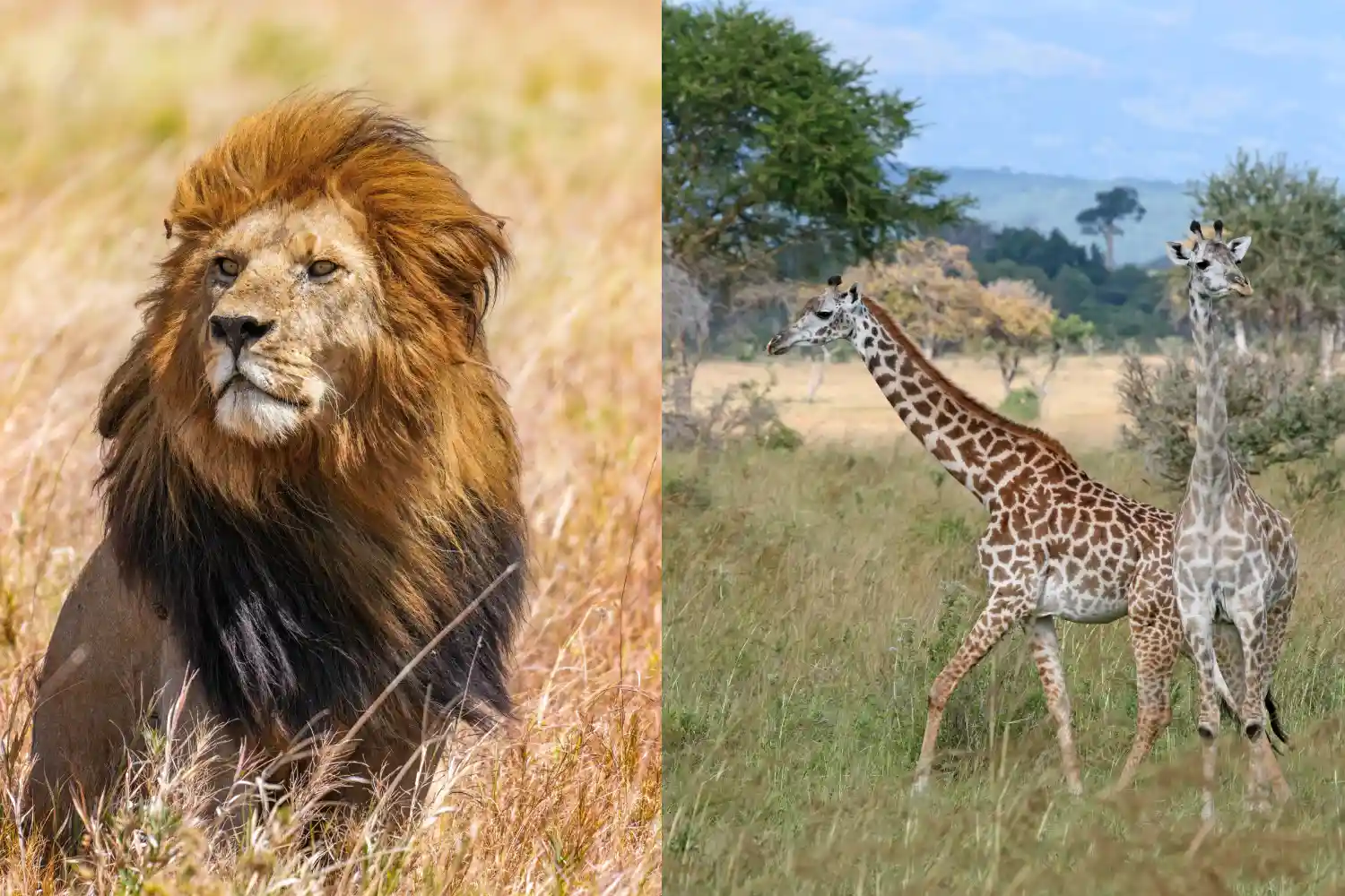
Serengeti Milli Parkı 14.750 km², UNESCO dünyası Sonsuz Savannas, Acacia Woodlands ve Rocky ile bilinen miras alanı Kopjes. Çeşitli ekosistemleri dünyanın en büyük vahşi yaşamından birini destekliyor popülasyonlar, onu kova listesi safari hedefi haline getiriyor.
Mikumi Milli Parkı , 3.230 km²'de daha küçük ama açık özellikler Savannas, Acacia ormanlık alanları ve mkata taşkın yatağı, genellikle bir Mini-Serengeti. Uluguru ve Rubeho Dağları tarafından çerçevelenmiş, kompakt bir şekilde sunuyor, Scenic Safari Deneyimi.
Vahşi yaşam
Serengeti Milli Parkı Büyük göç için ikonik, nerede İki milyondan fazla Willeebeest, Zebras ve Gazeller ovaları geçerek takip etti Aslanlar, leoparlar ve çitalar gibi yırtıcılar tarafından. Hepsini barındırır Buyuk Bükülme ( Aslanlar - Leoparlar - Dolgu - Mandalar - Ve Gergedan ) ve yıl boyunca çeşitli manzaralar sağlayan 500'den fazla kuş türü.
Mikumi Milli Parkı Big Five'ın dördünü (aslan, Leopar, fil, Buffalo), gergedan yok. MKATA taşkın yatağı zebralar çiziyor, Yabani ve Impalas, aslanlar ve sırtlanlar sık sık görüldü. 400'den fazla kuş Leylak göğüslü silindirler de dahil olmak üzere türler vahşi yaşam çekiciliğini geliştirir.
Fiyat
Serengeti Milli Parkı giriş ücretleri olan premium bir hedeftir Kişi başı 60-80 $, artı kamp veya koruma ücretleri. Safari maliyetleri, Kılavuzlar ve ulaşım dahil, kişi başı 250-600 $ arasında değişen uzak konumu nedeniyle daha yüksek masraflar.
Mikumi Milli Parkı bütçe dostu, giriş ücretleri Kişi başı 30-45 $. Oyun sürücüleri de dahil olmak üzere safari maliyetleri Kişi başına günlük 100-250 $, maliyet bilincine sahip gezginler için ideal Dar es Salaam'a yakınlık.
Konaklama Seçenekleri
Serengeti Milli Parkı Lüksden çeşitli konaklama sunar Four Seasons Safari Lodge (gecelik 500 $-1.200 $) gibi seçenekler Orta Aralık Serengeti Serena Safari Lodge (gecelik 150-350 $). Bütçe gezginleri seçebilir Seronera kampları (kişi başı 30-50 $) veya mobil çadır kampları için.
Mikumi Milli Parkı uygun fiyatlı konaklama sağlar Stanley’in Kopje Kampı (gecelik 200 $-400 $) ve orta menzilli gibi lüks localar Tan-Swiss Lodge (gecelik 50-150 $). Mikumi vahşi yaşamı gibi bütçe kampları Kamp, kişi başına gecelik 20-40 $ 'dan başlayın.
Cazibe merkezleri
Serengeti Milli Parkı tarafından tanımlanır Harika Göç , özellikle Mara Nehri geçişlerinde. Anahtar siteler arasında Seronera Vadisi, bir yaban hayatı merkezi; Yırtıcılar açısından zengin Lobo Hills; Ve Grumeti Timsahlarla tanınan nehir. Geniş manzaraları görsel bir gösteri.
Mikumi Milli Parkı MKATA taşkın yatağının etrafında döner, Otçulları ve yırtıcıları cezbetmek. Hippo havuzları, susturucu manzaralar sunar ve Timsahlar, çevredeki dağlar doğal güzellik katıyor. Açık ovaları Kolay yaban hayatı tespitini sağlayın.
Deneyimler ve Aktiviteler
Serengeti Milli Parkı kapsamlı oyun sürücüleri sunar, Büyük göçü izleyen çok günlük safarilerden yarım gün. Sıcak hava balonu Safariler (kişi başı 500 $-600 $) yürürken hava manzaraları sağlar ve Maasai kültürel ziyaretleri deneyimi zenginleştirir. Gece sürücüleri şurada mevcuttur Alanları seçin.
Mikumi Milli Parkı Oyun sürücülerine odaklanır, Boyutu nedeniyle yarım gün veya tam günlük turlar. Rangers ile yürüyüş safarileri bir Yakın çekim Bush deneyimi ve yakındaki köylere kültürel ziyaretler yerel sağlar içgörüler. Kuş gözlemci ıslak mevsimde mükemmeldir.
Erişilebilirlik
Serengeti Milli Parkı uzaktır, Arusha'dan 335 km (7-8 saat sürücü) veya Seronera gibi hava pistlerine 1-2 saatlik uçuş. Mesafesi artar maliyet ve safariler için 4x4 araç gerektirir.
Mikumi Milli Parkı kolayca erişilebilir, Dar Es'den 120 km A7 otoyolunda Salaam (3-4 saatlik sürüş) veya Morogoro'dan kısa bir sürüş. Onun Yakınlık, standart 4x4 araçları yeterlidir.
Ziyaret etmek için en iyi zaman
Serengeti Milli Parkı yıl boyunca idealdir. Kuru mevsim (Haziran-Ekim) Yaban hayatı izleme ve göç Nehri geçişleri için en iyisidir (Temmuz-Eylül). Islak Sezon (Kasım-Mayıs) Calving (Ocak-Mart) sunar Güneyde, yemyeşil manzara ve daha az kalabalık ile.
Mikumi Milli Parkı Kuru mevsimde parlıyor (Haziran-Ekim), Hayvanlar su kaynakları etrafında toplandığında. Islak Sezon (Kasım-Nisan) Bazı yollar çamurlu olsa da, yemyeşil manzaralar ve kuş gözlemciliği sağlar.
Kalabalık
Serengeti Milli Parkı özellikle büyük kalabalıklar çekiyor, özellikle . Harika Göç (Temmuz-Eylül). Seronera gibi alanlar meşgul olabilir, ancak uzak Kuzey veya batı koridorları gibi bölgeler daha sessiz deneyimler sunar.
Mikumi Milli Parkı Sakin bir safari sağlayan daha az kalabalık daha az araç ile. Güney yeri ana turist izinden uzak tutar, daha samimi bir deneyim sağlamak.
Serengeti vs Mikumi Milli Parkı Hakkında SSS
Hangi park için daha iyi Big Beş'i mi görüyorsunuz?
Serengeti, gergedanlar da dahil olmak üzere büyük beşi tespit etmek için üstündür. geniş ekosistemler. Mikumi, Big Beş'in dördüne ev sahipliği yapıyor, ancak gergedan değil Sunmak.
Serengeti veya Mikumi daha fazla bütçe dostu mu?
Mikumi, daha düşük giriş ücretleri ve konaklama ile daha bütçe dostudur. Dar es Salaam'dan daha kolay erişim. Serengeti uzaktan kumandası nedeniyle daha pahalı konum.
Kısa bir ziyaret için hangi park daha iyidir?
Mikumi, Dar es Salaam'a yakınlığı nedeniyle kısa ziyaretler için daha iyidir ve Daha küçük boyut, günlük geziler için idealdir. Serengeti seyahat için daha fazla zaman gerektirir ve keşif.
Her iki parkı da bir safaride birleştirebilir miyim?
Serengeti ve Mikumi'yi birleştirmek mümkündür, ancak onların Kuzey ve güney yerleri, genellikle uçuşlar veya uzun sürücüler gerektirir.
Son Düşünceler
Arada Seçiminiz Serengeti Ve Mikumi Bütçe, zaman ve safari hedeflerine bağlı. Serengeti bir ikonik sunar, Büyük Göç, Büyük Beş ve Çeşitli Etkinlikler ile Sürükleyici Deneyim, Daha yüksek maliyetlere ve kalabalığa rağmen birinci sınıf bir macera arayanlar için idealdir. Mikumi, Bütçe Gezginleri veya Sınırlı Süreli olanlara, Samimi Sunan Big Beş, Daha Az Kalabalık ve Dar Es'den Kolay Erişim ile Safari Selam. Her iki park da unutulmaz Tanzanya vahşi yaşam deneyimleri vaat ediyor ve Onları birleştirmek planlama gerektirirken, her biri dikkate değer bir bağımsızdır varış noktası.