Serengeti vs Masai Mara | Top Doğu Afrika Safari Destinasyonlar
Serengeti Milli Parkı Tanzanya'da ve Masai Mara Ulusal Rezervi Kenya'da Doğu Afrika’nın en ikonik safari destinasyonlarından ikisi var, Aynı ekosistemi ve büyük göçü paylaşmak. Her ikisi de birinci sınıf vahşi yaşam sunarken Deneyimler, boyut, erişilebilirlik, maliyetler ve kalabalık seviyeleri bakımından farklılık gösterirler. Bu karşılaştırma Parkların, vahşi yaşamın, maliyetlerin, konaklama yerlerinin, cazibe merkezlerinin, aktivitelerin doğasını araştırır. Erişilebilirlik, ziyaret etmek için en iyi zaman ve ideal Safari hedefini seçmenize yardımcı olacak kalabalıklar.
Serengeti vs Masai Mara: Hangi Safari için doğru Sen?
Hem Serengeti hem de Masai Mara, geniş savanları ve Büyük göç, ancak her biri benzersiz bir safari deneyimi sunar. Olsun Serengeti’nin geniş vahşi doğasına veya Masai Mara’nın kompaktına çekildi Predator açısından zengin ovalar, bu rehber rehberlik etmek için temel farklılıkları yıkıyor Seçiminiz.
Parkın doğası
Serengeti Milli Parkı Tanzanya'da 14.750 km²'ye yayılıyor, UNESCO Geniş Savannas, Acacia Woodlands, Riverine ile bilinen Dünya Mirası Sitesi ormanlar ve kayalık Kopjes. Muazzam boyutu ve çeşitli ekosistemleri dünyanın en büyük yaban hayatı nüfusunun.
Maasai Mara Ulusal Rezervi , Kenya'da 1.510 km²'yi kapsayan, Daha küçük ama açık otlaklar, akasya noktalı ovalar ve Mara Nehri içerir. Serengeti ekosisteminin bir uzantısı olarak, daha konsantre bir Çarpıcı manzaralarla yaban hayatı deneyimi.
Vahşi yaşam
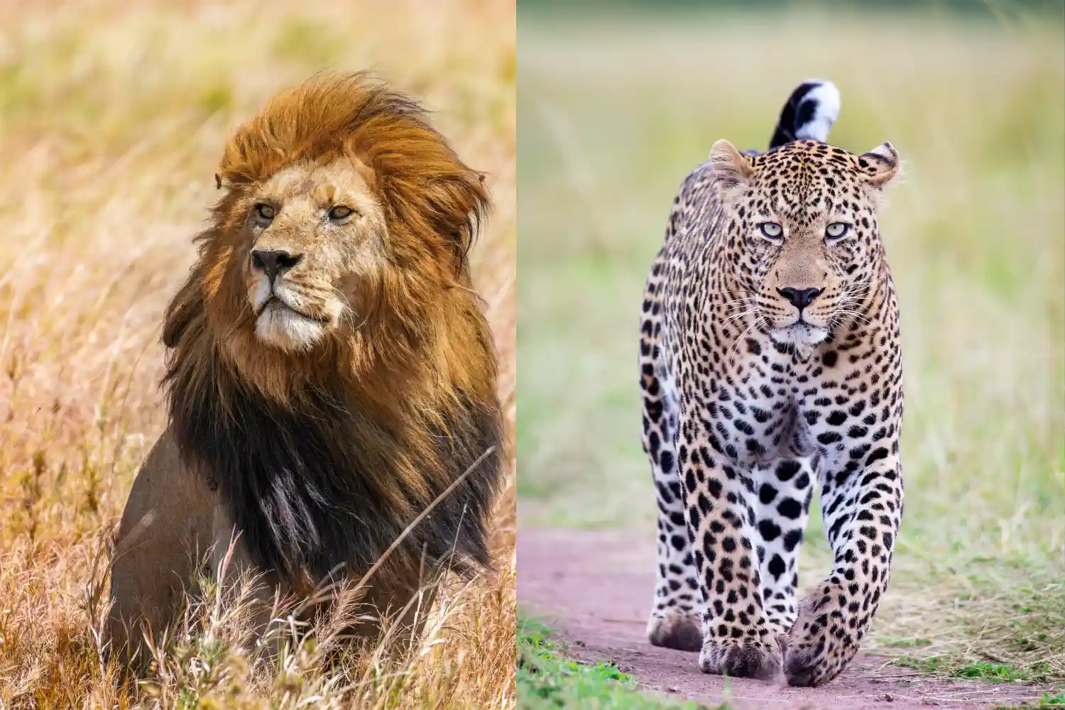
Serengeti Milli Parkı büyük göçle ünlüdür Ovalarında hareket eden iki milyondan fazla Willeebeest, Zebras ve Gazeller, Aslanlar, leoparlar ve çitalar gibi yırtıcıları cezbetmek. Hepsini barındırır Buyuk Bükülme ( Aslanlar - Leoparlar - Dolgu - Mandalar - Ve Gergedan ) ve yıl boyunca çeşitli manzaralar sağlayan 500'den fazla kuş türü.
Maasai Mara Ulusal Rezervi Ayrıca özellikler Harika Göç , özellikle Mara Nehri'ndeki nehir geçişleri sırasında dramatik. Yüksek yırtıcı yoğunluğu, özellikle aslanlar ve çitalarla ünlüdür ve Gergedanlar daha nadir olsa da, tüm Big Five'a ev sahipliği yapıyor. 450'den fazla kuş türü, dahil Akbabalar ve kartallar, burada gelişir.
Fiyat
Serengeti Milli Parkı giriş ücretleri olan premium bir hedeftir Kişi başı 60-80 $, artı kamp veya koruma ücretleri. Safari maliyetleri, Kılavuzlar, ulaşım ve konaklama dahil, kişi başı 250-800 $ arasında değişmektedir Günde, uzak konumu nedeniyle daha yüksek masraflarla.
Maasai Mara Ulusal Rezervi 80-100 dolarlık giriş ücreti var günde kişi (yerleşik olmayanlar için daha yüksek). Safari maliyetleri başına 200 $-700 $ arasında değişiyor Günde kişi, Nairobi'ye yakınlık nedeniyle genellikle serengeti biraz daha düşük Ve daha fazla bütçe seçeneği, yoğun sezon (Temmuz-Ekim) pahalı olabilir.
Konaklama Seçenekleri
Serengeti Milli Parkı Lüksden çeşitli konaklama sunar Four Seasons Safari Lodge (gecelik 500 $-1.200 $) gibi localar orta menzile Serengeti Serena Safari Lodge (gecelik 150-350 $). Bütçe gezginleri seçebilir Seronera kampları (kişi başı 30-50 $) veya mobil gibi kamu kampları Çadır kampları.
Maasai Mara Ulusal Rezervi bir dizi konaklama sağlar, Mara Serena Safari Lodge gibi lüks kamplardan (gecelik 400-1000 $) Keekorok Lodge (gecelik 100-300 $) gibi orta menzilli seçenekler. Bütçe kampları Ve Riverside Camp gibi çadır kampları, kişi başı 20-50 $ 'dan başlıyor.
Cazibe merkezleri
Serengeti Milli Parkı tarafından tanımlanır Harika Göç , Mara Nehri için Crossings gibi önemli yerlerle, Seronera Yıl boyunca vahşi yaşam için Vadi ve yırtıcılar için Lobo Tepeleri. Grumeti Nehri Timsah manzaralar sunar ve parkın geniş manzaraları görsel bir harikadır.
Maasai Mara Ulusal Rezervi Mara Nehri merkezleri, ünlü Dramatik göç geçişleri için. Musiara bataklığı ve cennet ovaları Predator sıcak noktaları, Oloololo Escarpment çarpıcı manzaralar sunuyor. Onun Kompakt boyut, sık sık yaban hayatı karşılaşmalarını sağlar.
Deneyimler ve Aktiviteler
Serengeti Milli Parkı kapsamlı oyun sürücüleri sunar, Büyük göçü izleyen çok günlük safarilerden yarım gün. Sıcak hava balonu Safariler (kişi başı 500 $-600 $) hava manzaraları sağlarken, rehberli yürüyüş Safariler ve Masai kültürel ziyaretleri çeşitlilik katar. Gece sürücüleri şurada mevcuttur Alanları seçin.
Maasai Mara Ulusal Rezervi Oyun sürücülerine odaklanır, ideal Yırtıcıları tespit etme şansı ile kompakt boyutu. Sıcak hava balonu Safariler (kişi başı 400 $-550 $) popüler ve Masai ile yürüyüş safarileri Rehberler samimi bir deneyim sunar. Masai köylerine kültürel ziyaretler sağlar Yerel içgörüler.
Erişilebilirlik
Serengeti Milli Parkı uzaktır, Arusha'dan 335 km (7-8 saat sürücü) veya Seronera gibi hava pistlerine 1-2 saatlik uçuş. Mesafesi artar Maliyetler ve Safariler için 4x4 araç gerektirir, erişim için planlama yapılır.
Maasai Mara Ulusal Rezervi daha erişilebilir, 270 km uzakta Nairobi (5-6 saatlik sürüş) veya Keekorok veya OL gibi hava pistlerine 45 dakikalık bir uçuş Kiombo. Nairobi'ye yakınlığı, 4x4 ile daha kısa yolculuklar için idealdir. Oyun sürücüleri için gerekli araçlar.
Ziyaret etmek için en iyi zaman
Serengeti Milli Parkı yıl boyunca mükemmel. Kuru mevsim (Haziran-Ekim) Yaban hayatı izleme ve göç Nehri geçişleri için en iyisidir (Temmuz-Eylül). Islak Sezon (Kasım-Mayıs) Calving (Ocak-Mart) sunar Güneyde, yemyeşil manzara ve daha az kalabalık ile.
Maasai Mara Ulusal Rezervi kuru mevsimde en iyisidir (Temmuz-Ekim), ne zaman Harika Göç Nehir geçişleri ile zirveler. Islak Sezon (Kasım-Nisan) Daha az kalabalık ancak çamurlu izler ile yemyeşil manzaralar ve kuş gözlemciliği sağlar bazı alanlar.
Kalabalık
Serengeti Milli Parkı Büyük sırasında kalabalığı çeker Göç (Temmuz-Eylül), özellikle Seronera gibi popüler alanlarda. Onun Geniş boyut, kuzey gibi uzak bölgelerde daha sessiz deneyimler sağlar veya Batı koridorları.
Maasai Mara Ulusal Rezervi zirvede kalabalık hissedebilir Göç sezonu (Temmuz-Ekim), özellikle nehir geçişleri etrafında. Daha küçük Boyut, kilit alanlarda daha fazla araç anlamına gelir, ancak özel korumalar daha az sunar kalabalık alternatifler.
Serengeti vs Masai Mara Hakkında SSS
Harika olanı görmek için daha iyi Göç?
Her iki park da harika göç manzaraları sunuyor, ancak Maasai Mara dramatik için ideal River Crossings (Temmuz-Ekim), Serengeti daha geniş bir göç sağlar yıl boyunca deneyim.
Serengeti mi yoksa Masai Mara Bütçe dostu mu?
Maasai Mara, daha düşük giriş ücretleri ve Nairobi'ye yakınlık, ancak maliyetler mevsim ve konaklamaya göre değişir. Serengeti genellikle daha pahalıdır.
Kısa bir ziyaret için hangi park daha iyidir?
Maasai Mara, daha küçük boyutu ve erişilebilirliği nedeniyle kısa ziyaretler için daha iyidir Nairobi'den, 2-3 günlük safariler için idealdir. Serengeti seyahat için daha fazla zaman gerektirir ve keşif.
Her iki parkı da bir safaride birleştirebilir miyim?
Evet, Serengeti ve Maasai Mara'yı birleştirmek, aynı şeyi paylaştıkları için popülerdir. ekosistem. Uçuş veya sınır ötesi sürücülere sahip çok günlük bir safari, ikisi birden.
Son Düşünceler
Aralarında Seçim Serengeti Ve Masai Mara Safari önceliklerinize, bütçenize ve zamanınıza bağlıdır. Serengeti, çeşitli manzaralarla geniş ve sürükleyici bir deneyim sunuyor, yıl boyunca vahşi yaşam ve daha sessiz uzak alanlar, arayanlar için ideal Daha yüksek maliyetlere rağmen kapsamlı macera. Masai Mara, Gezginlere Uyar Daha az zaman veya daha sıkı bütçeler, özellikle yoğun vahşi yaşam karşılaşmaları, özellikle Göç Nehri geçişleri sırasında, kompakt, erişilebilir bir ortamda. İkisi de dünya standartlarında hedefler ve bunları tek bir güzergahta birleştirmek Ultimate Doğu Afrika Safari Deneyimi.