Zanzibar vs Madagaskar | En iyi Hint Okyanusu Adası Destinasyonlar
Zanzibar - Bir Tanzanya takımadaları ve dünyanın dördüncü en büyük adası olan Madagaskar Hint Okyanusu’nın en büyüleyici destinasyonu, her biri çarpıcı plajlar, benzersiz kültürler sunuyor, ve çeşitli faaliyetler. Her ikisi de tropikal cazibe vaat ederken, farklı seyahatlere hitap ediyorlar stiller. Bu karşılaştırma plajları, maliyetleri, konaklamaları, aktiviteleri, kültürü araştırıyor, Erişilebilirlik, ziyaret etmek için en iyi zaman ve mükemmel ada kaçışınızı seçmenize yardımcı olmak için vibe.
Zanzibar vs Madagaskar: Hangi ada macerası takım elbise Sen?
Zanzibar’ın Svahili cazibesi ve erişilebilir plajları Madagaskar’ın Geniş vahşi doğa ve eşsiz biyolojik çeşitlilik. Kültürel bir plaj arıyor olun Kaçış veya dövülmüş bir yol eko-macera, bu kılavuz anahtar vurgular Seçiminize rehberlik etmek için farklılıklar.
Plajlar
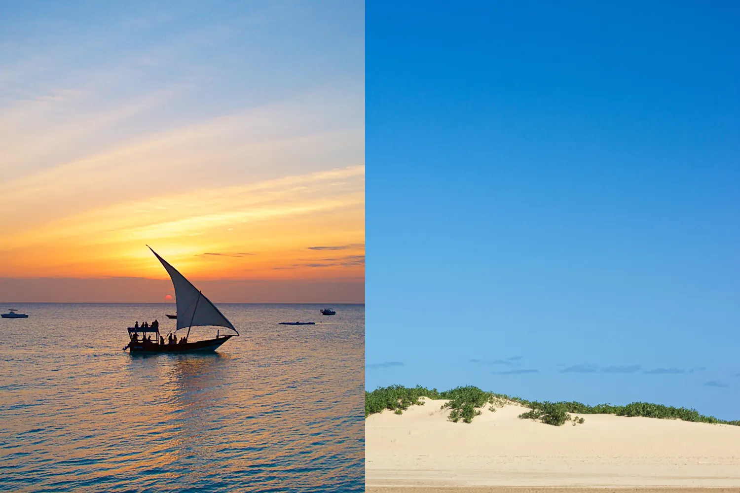
Zanzibar Nungwi, Kendwa gibi pastoral plajlarıyla ünlüdür, ve paje, toz beyaz kum ve turkuaz suları ile. Gelgit varyasyonları olabilir Yüzmeyi etkiler, ancak Mnemba Atolü çevresindeki mercan resifleri canlı şnorkel sunar ve dalış fırsatları.
Madagaskar özellikle adalarda çarpıcı plajlara sahiptir Nosy Be, î Sainte-Marie ve Anakao, yumuşak kumlar ve berrak sularla. Sırasında Zanzibar’dan daha az gelişmiş olan bu plajlar, daha tenha, el değmemiş bir Vibe, sakin kaçışlar için ideal.
Fiyat
Zanzibar Kişi başı günlük maliyeti 50-2 $ 'dır. Bütçe Konaklama, gecelik 20-50 $, orta menzilli 80-150 $ ve lüks olarak başlıyor Zuri Zanzibar gibi tatil köyleri 300-600 dolar. Yemeklerin maliyeti 5-20 $ ve aktiviteler Şnorkelli yüzme 20-50 $ arasında değişiyor.
Madagaskar Günlük maliyetlerle 40-250 dolar ile geniş ölçüde değişir kişi. Nosy Be veya Morondava'da bütçe seçenekleri gecelik 15-40 $ 'dan başlıyor, Orta menzilli 50-100 dolar ve Anjajavy gibi lüks localar 500-1,000 dolar. Yemek Maliyet 3- 15 $, ancak dahili seyahat ve uzak turlar (50-150 $) eklenebilir.
Konaklama Seçenekleri
Zanzibar Bütçe misafirhanelerinden çeşitli konaklamalar sunar Emerson gibi Stone Town'daki butik otellere Mnarani Beach Cottages (30-80 $) Hurumzi (100-200 $) ve Baraza Resort (400-800 $) gibi lüks tatil köyleri. Seçenekler konsantre ve erişilebilir.
Madagaskar Nosy'deki bütçe bungalovlarından çeşitli konaklama var Vanilla Hotel (20-50 $) gibi Chez Maggie (50-120 $) gibi orta menzilli eko-lodges gibi ve Constance Tsarabanjina (400-900 $) gibi üst düzey tatil köyleri. Konaklama Genellikle iç seyahat gerektiren yayılır.
Faaliyetler
Zanzibar Mnemba'da dalış da dahil olmak üzere deniz faaliyetlerinde mükemmel Atoll (50-100 $), şnorkel (20-50 $) ve Paje'de uçurtma sörfü. Kara tabanlı seçenekler Spice Tours'u içerir (20-40 $), Çirkin Şehir Kültürel Yürüyüşler (15-30 $) ve Jozani Orman Red Colobus maymunları için (10-20 $).
Madagaskar Doğa severler için bir cennet, gibi aktiviteler Andasibe-Mantadia veya Ranomafana Milli Parklarında Lemur SPTING (30-80 $), île Sainte-Marie'de (Haziran-Eylül, 50-100 $) balina izliyor ve yürüyüşe çıkıyor Tsingy de Bemaraha (40-120 $). Nosy Be Dalış ve Şnorkel (30-80 $) sunar.
Kültür
Zanzibar Stone Town’un Svahili kültürü açısından zengin Arap, Hint ve Afrika etkilerini sergileyen UNESCO ile listelenen tarihi yerler. Spice Plantations, Dhow Tekne Gezileri ve Taarab müzik performansları sürükleyici kültürel deneyimler.
Madagaskar Austronean'ı harmanlayan benzersiz Madagaskar kültürü sunuyor ve Afrika kökleri. Geleneksel köyler, famadihana gibi ataların ritüelleri ve Ancak Antananarivo veya Ambalavao'daki yerel pazarlar kültürel derinlik sağlar Bunlara erişmek genellikle plaj alanlarının ötesinde seyahat gerektirir.
Erişilebilirlik
Zanzibar Abeid Amani Karume International aracılığıyla kolayca ulaşılabilir Havaalanı, Dar es Salaam (20 dakika, 50-100 $) veya Nairobi'den uçuşlarla (150 $-300 $). Dar es Salaam'ın feribotları 2 saat sürer (35-50 $). Vizek Maliyeti Çoğu millet için varışta 50-100 dolar.
Madagaskar Ivato Uluslararası Havaalanı aracılığıyla erişiliyor Antananarivo, Johannesburg, Nairobi veya Paris'ten (400-1,200 $) uçuşlarla. İç uçuşlar veya uzun sürücüler (ör. Nosy Be, 100-250 $) genellikle gereklidir. Vizeler 30 güne kadar varışta 35-50 dolar.
Ziyaret etmek için en iyi zaman
Zanzibar kuru mevsimlerde idealdir: Haziran-Ekim ve Aralık-Şubat, 25-30 ° C açık gökyüzü ve sıcaklıklarla. Kısa Yağmurlar (Kasım) ve uzun yağmurlar (Mart-Mayıs) nem getiriyor ancak daha düşük fiyatlar ve daha az kalabalıklar.
Madagaskar Nisan-Kasım ayından en iyisi, kuru hava ile ve 20-30 ° C sıcaklık. Temmuz-Eylül Nosy Be Plajlar ve Balina İçin Zirve izliyor. Islak mevsim (Aralık-Mart) siklonlar ve şiddetli yağmur getiriyor, özellikle doğu bölgelerinde.
Titreşim
Zanzibar Sakin plajları harmanlayan rahat bir ada havasına sahiptir Canlı Svahili Kültürü. Kompakt boyutu ve erişilebilir cazibe merkezleri Rahatlama, macera ve kültürel daldırma karışımı arayan gezginler.
Madagaskar Geniş ve maceracı bir vibe sunuyor manzaralar ve keşif duygusu. Uzak plajları ve eşsiz vahşi yaşamı Eko-seyahatçilere ve şebeke dışı bir deneyim özlemine hitap ediyor.
Zanzibar vs Madagaskar Hakkında SSS
Ki bu daha bütçe dostu, Zanzibar mı yoksa Madagaskar mı?
Zanzibar genellikle daha uygun fiyatlı konaklama ile daha bütçe dostudur ve yemek seçenekleri. Madagaskar bütçe seyahati için daha ucuz olabilir, ancak daha yüksek uzak alanlar için maliyetler.
Hangi hedef daha fazla kültürel sunuyor deneyimler?
Zanzibar, Svahili Mirası ve Taşı ile daha zengin kültürel deneyimler sunar Şehir. Madagaskar benzersiz Madagaskar kültürü sunar, ancak daha fazla seyahat gerektirir Kültürel sitelere erişin.
Yaban hayatı ve doğa için daha iyi faaliyetler?
Madagaskar, lemurlar ve çeşitli gibi eşsiz türlerle vahşi yaşam için eşsizdir ekosistemler. Zanzibar, dalış ve şnorkel gibi deniz aktivitelerinde mükemmeldir.
Zanzibar ve Madagaskar'ı bir yolculukta birleştirebilir miyim?
Her ikisini de birleştirmek mümkündür, ancak uçuş bağlantıları ve maliyetleri nedeniyle zorlayıcıdır. A Çoklu tesis gezisi genellikle Zanzibar'ı Tanzanya safarisiyle eşleştirirken Madagaskar genellikle bağımsız bir maceradır.
Son Düşünceler
Aralarında Seçim Zanzibar Ve Madagaskar Seyahat hedeflerinize ve tercihlerinize bağlıdır. Zanzibar bunlar için idealdir Çarpıcı plajlarla erişilebilir, bütçe dostu bir ada kaçışı aramak, zengin Svahili kültürü ve deniz maceraları, rahat ama kültürel olarak mükemmel Sürükleyici tatil. Madagaskar takım elbise maceracı gezginler Yaban hayatı, el değmemiş plajlar ve geniş, dövülmüş bir deneyim, ancak Daha fazla planlama ve masraf gerektirir. Her ikisi de unutulmaz Hint Okyanusu sunuyor Maceralar, ancak Zanzibar cilalı cazibe sunarken, Madagaskar Raw vaat ediyor, vahşi güzellik.