Serengeti vs masasai mara | Oke ti Ila-oorun Iwọ-oorun Iwọ-oorun Iwọ-oorun Awọn ibi
Frentigeli Ande-ane Park Ni Tanzania ati Masaii Mara National Reserve Ni Kenya jẹ meji ninu awọn ibi-Afirika ọba ti ila-oorun ti ila-oorun julọ, Pinpin awọn ilolupo kanna ati ijira nla. Lakoko ti awọn mejeeji nfunni ni ẹgbẹ egan ti agbaye Awọn iriri, wọn yatọ ni iwọn, oju aye, wiwọle, awọn idiyele, ati awọn ipele eniyan. Lafiwe yii Ṣawari iseda ti awọn itura, ẹranko igbẹ, awọn idiyele, awọn ibugbe, awọn ifalọkan, awọn iṣẹ, Wiwọle, akoko ti o dara julọ lati ṣabẹwo, ati peges lati ṣe iranlọwọ fun ọ lati yan ibi giga Safari ti o dara julọ.
Serengeti vs masasan Mara: Safari ti o tọ fun Iwọ?
Mejeeji ṣeregeti ati masai mara ti wa ni olokiki fun saransas nla wọn ati awọn Iṣilọ nla, ṣugbọn ọkọọkan n funni ni iriri Safari alailẹgbẹ kan. Boya o wa fa si siletitetito ti o faagun si aginjù tabi iwapọ Masai, Awọn asọtẹlẹ-ọlọrọ-ọlọrọ, itọsọna yii fọ ba awọn iyatọ bọtini naa pada si itọsọna Yiyan rẹ.
Iseda ti o duro si ibikan
Sarengeti orilẹ-ede Park Spans 14,750 KM² ni Tanzania, Unesco Aaye ile-ini agbaye ti a mọ fun awọn oniwe-owo Sarannas, Acacia Edan, osu Awọn igbo, ati awọn apata kopus. Iwọn rẹ titobi julọ ati awọn ilana ilodipọ awọn ilopọ ti awọn olugbe oorun ti o tobi julọ ni agbaye.
Masaii Mara National Reserve , ibora 1,510 km ni Kenya, jẹ Kekere ṣugbọn awọn aṣọ ibora ṣii, awọn pẹtẹlẹ acacia-ti a ṣẹda, ati Odò Mara. Gẹgẹbi itẹsiwaju ti Ecosystem Ecosystem, o funni ni ifunni diẹ sii Iriri egan pẹlu awọn oju-aye iyalẹnu.
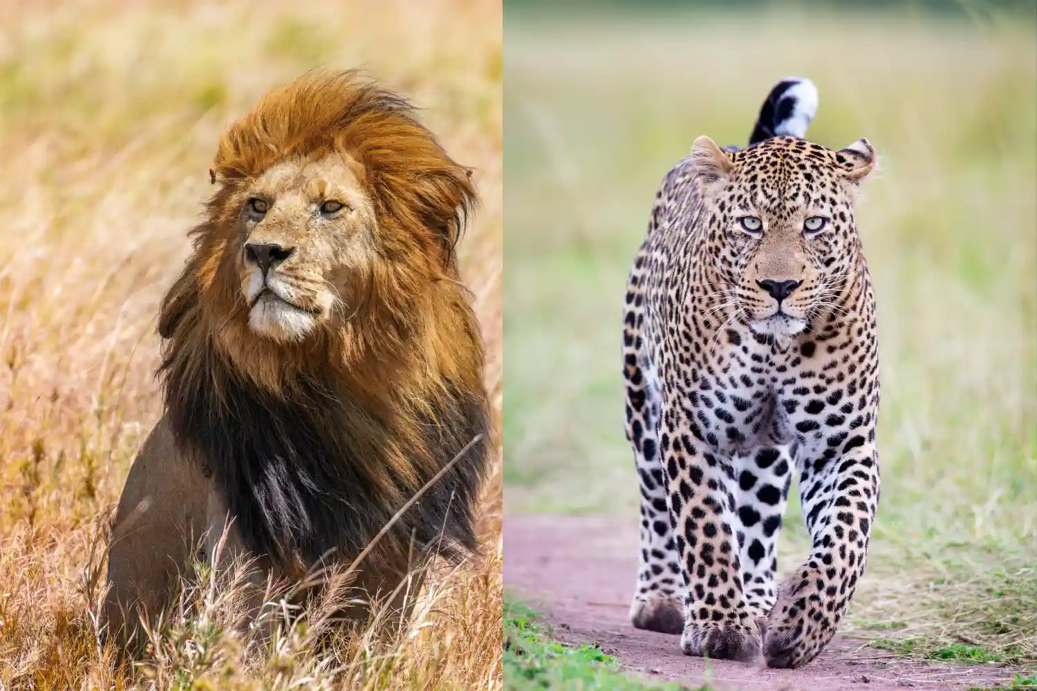
Ẹranko igbẹ
Sarengeti orilẹ-ede Park jẹ olokiki fun ijira nla, pẹlu Ju million meji mildests, zebra, ati gazles gbigbe kọja awọn pẹtẹlẹ rẹ, Famọra awọn apanirun bi awọn kiniun, awọn amotekun, ati awọn cheetahs. O gbalejo gbogbo Totobi Irin ( Ai-ika , Aloku , Erin , N'frect , ati Ààsà ) ati ju awọn eeje ẹyẹ 500 lọ, aridaju awọn iwoniran ti n yika.
Masaii Mara National Reserve tun ṣe ẹya naa Nla Ipora , pataki iyalẹnu lakoko awọn iyipo odo ni odò Mara. O ti logo fun iwuwo ti a pejọ giga rẹ, paapaa awọn kiniun ati cheetahs, ati Awọn gbalejo gbogbo nla marun, botilẹjẹpe awọn asagi jẹ rarer. O ju 450 eye eya, pẹlu Awọn asan ati idì, ni rere nibi.
Idiyele
Sarengeti orilẹ-ede Park jẹ opin irin ajo pẹlu awọn owo titẹsi ti $ 60- $ 80 fun eniyan fun ọjọ kan, pẹlu ibudó tabi awọn idogo itọju. Awọn idiyele Safari, pẹlu awọn itọsọna, irinna, ati ibugbe, ibiti lati $ 250- $ 800 fun eniyan kan Fun ọjọ kan, pẹlu awọn inawo ti o ga julọ nitori ipo latọna jijin rẹ.
Masaii Mara National Reserve ni awọn idiyele titẹsi ti $ 80- $ 100 fun eniyan fun ọjọ kan (giga fun awọn olugbe). Safari idiyele tun wa lati $ 200- $ 700 fun eniyan fun ọjọ kan, nigbagbogbo kekere kekere ju serengeti nitori isunmọtosi si nairobi Awọn aṣayan isuna ati diẹ sii ti akoko tente oke (Oṣu Keje-Oṣu Kẹwa) le jẹ sanra.
Awọn aṣayan ibugbe
Sarengeti orilẹ-ede Park nfunni ni jidi ninu, lati inu igbadun awọn agbegbe bi awọn akoko mẹrin ti Safari Lodge ($ 500- $ 1,200 fun alẹ-ọrun) si aarin-ibiti Serfeti Serena Safari Lodge ($ 150- $ 350 fun alẹ). Awọn arinrin ajo isuna le yan Awọn ibudo ti gbogbo eniyan bi Arsone Catere ($ 30- $ 50 fun eniyan fun alẹ kan) tabi alagbeka awọn ibudo agọ.
Masaii Mara National Reserve pese ọpọlọpọ awọn ibugbe, Lati awọn ago ti igbadun bi Mara Serna Serna Serna Sunari Lodge ($ 400- $ 1,000 fun alẹ kan) si Awọn aṣayan aarin-ibiti Kekirok Lodge ($ 100- $ 300 fun alẹ). Awọn ibudo isuna Ati awọn ibudó agọ, gẹgẹ bi ibudó nla, bẹrẹ ni $ 20- $ 50 fun eniyan fun alẹ kan.
Ifalọkan
Sarengeti orilẹ-ede Park ti ṣalaye nipasẹ awọn Nla Ipora , pẹlu awọn aaye bọtini bi ARRA Odò Mari fun awọn irekọja, Se esakera Afonifoji fun igbẹ-oorun ti o jẹ ọdun, ati awọn oke kekere lobo fun awọn apanirun. Odò Greeti Fun awọn iwoju ootodile, ati awọn oju-aye ti o da duro ti o duro si ibikan jẹ iyalẹnu wiwo.
Masaii Mara National Reserve Awọn ile-iṣẹ lori Odò Mara, olokiki fun awọn agbeleri Iṣilọ Iṣilọ. Awọn papa-iṣere Muria ati awọn pẹtẹlẹ paradise jẹ Apanirun hotspots, lakoko ti o ti mu ufurprepment ormolo nfunni ni iyalẹnu awọn wiwo iyalẹnu. Tirẹ Iwọn iṣiro ṣe idaniloju awọn alabapade egan loorekoore.
Awọn iriri ati awọn iṣẹ
Sarengeti orilẹ-ede Park nfunni awọn awakọ ere idaraya pupọ, lati Ọjọ-idaji si ipasẹ-rere ọjọ-safrising awọn ijira nla. Baluu gbona safaris ($ 500- $ 600 fun eniyan kan) pese awọn iwo nla, lakoko ti o ti n rin irin-ajo itọsọna Safaris ati awọn ọdọọdun aṣa ti Maasai kan ṣafikun orisirisi. Awọn awakọ alẹ wa ninu Yan awọn agbegbe.
Masaii Mara National Reserve fojusi awọn awakọ ere, bojumu fun Iwọn idapọpọ rẹ, pẹlu awọn aye giga ti gbilẹ awọn apanirun. Baluu gbona Safaris ($ 400- $ 550 fun eniyan) jẹ olokiki, ati rin safari pẹlu masaii Awọn itọsọna pese iriri timotimo. Awọn ibebe aṣa si awọn abule Masaia pese awọn oye ti agbegbe.
Iyẹ
Sarengeti orilẹ-ede Park Ṣe latọna jijin, 335 km lati arsha (wakati 7-8 wakọ) tabi ọkọ ofurufu wakati 1-2 kan si awọn afẹfẹ bi obrome. Ijinna rẹ pọ si Awọn idiyele ati nilo awọn ọkọ 4x4 fun safaris, pẹlu gbimọ nilo fun iraye.
Masaii Mara National Reserve jẹ iraye si, 270 km lati Nairobi (awọn awakọ wakati 5-6) tabi ọkọ ofurufu ti iṣẹju 45 si awọn airstrips bi Keikerok tabi Ol Kiombo. Isunmọ rẹ si Nairobi jẹ ki o bojumu fun awọn irin ajo kukuru, pẹlu 4x4 Awọn ọkọ ti o nilo fun awọn awakọ ere.
Akoko ti o dara julọ lati ṣabẹwo
Sarengeti orilẹ-ede Park jẹ ti o dara julọ ni ayika. Akoko gbigbẹ (Oṣu Kẹwa-Oṣu Kẹwa) dara julọ fun wiwo igbẹ ati awọn irekọja ijisi (Oṣu Keje-Kẹsán). Akoko tutu (Kọkànlá Oṣù-May) nfunni ni Calving (Oṣu Kini Ni guusu, pẹlu iwoye ọti ati awọn asiko kekere.
Masaii Mara National Reserve dara julọ lakoko akoko gbigbẹ (Oṣu Keje-Oṣu Kẹwa), nigbati awọn Nla Ipora awọn oke pẹlu awọn iyipo odo. Akoko tutu (Oṣu kọkanla) Pese awọn ibi-ilẹ lush ati Bibajẹ, pẹlu awọn asiko kekere ṣugbọn awọn orin muddy ninu Diẹ ninu awọn agbegbe.
Asiko
Sarengeti orilẹ-ede Park ṣe ifamọra awọn eniyan lakoko nla Iṣilọ (Keje-Kẹsán), ni pataki ni awọn agbegbe olokiki bi Sromera. Tirẹ Iwọn šasi ngbanilaaye fun awọn iriri iṣẹ-ede ni awọn agbegbe latọna jijin bi ariwa tabi awọn ọdẹdẹ iwọ-oorun.
Masaii Mara National Reserve le lero ti o pọpọ lakoko tente oke Akoko Iṣilọ (Oṣu Keje-Oṣu Kẹwa), pataki ni ayika awọn agbelebu odo. O kere ju Iwọn tumọ si awọn ọkọ ti o wa ni awọn ọkọ oju omi, ṣugbọn awọn ile-iṣẹ aladani kan fun dinku Awọn miiran ti a fi kun.
Awọn ibeere nipa samengeti vs masasai mara
Eyiti o dara julọ fun ri nla Iṣilọ?
Awọn aaye mejeeji nse awọn iwo ipa nla, ṣugbọn masai mara jẹ apẹrẹ fun iyalẹnu Odò odo (Oṣu Keje-Oṣu Kẹwa), lakoko ti Serngeti pese ijihun gbooro kan ni iriri ọdun yika.
Ti wa ni Serjeceti tabi masaii mara diẹ sii Isuna-ọrẹ?
Masaia Mara le jẹ diẹ isuna-ore diẹ sii nitori awọn owo titẹsi isalẹ ati isunmọ si nairobi, botilẹjẹpe awọn idiyele yatọ nipasẹ akoko ati ibugbe. Sermegedu ti wa ni gbogbogbo pricier.
Egan ti o dara julọ fun ibewo kukuru?
Masaia Mara dara julọ fun awọn ọdọọdun kukuru nitori iwọn rẹ kere ati wiwọle Lati Nairobi, bojumu fun Safaris ọjọ 2-3. Serngeti nilo akoko diẹ sii fun irin-ajo ati iṣawari.
Ṣe Mo le darapọ mọ awọn papa itura mejeeji ni safari kan?
Bẹẹni, apapọ serenegeti ati masai mara jẹ olokiki, bi wọn ṣe pin kanna ilolupo. Olori ọjọ-ori pupọ pẹlu awọn ọkọ ofurufu tabi awọn awakọ ilẹ-ila le bo Mejeeji.
Awọn ero ikẹhin
Yiyan laarin Sermege ati Masaii Mara Da lori awọn pataki rẹ Safari, isuna, ati akoko. Sernegeti nfunni ni gbigbega, iriri gbimọ pẹlu awọn oju-ọrun, Aganfa Agangan-ọdun, ati awọn agbegbe latọna jijin, bojumu fun awọn ti n wa a Orgale Trence pẹlu awọn idiyele ti o ga julọ. Masaii Mara ṣe awọn arinrin ajo pẹlu Akoko diẹ tabi awọn isuna tighter, fifiranṣẹ awọn alabapade eganti to intelefe, ni pataki Lakoko awọn irekọja odo irinna, ni iwapọ, eto ti o wọle. Mejeeji jẹ Awọn ibi-ipari agbaye, ati apapọ wọn ni ipani kan ṣoṣo ni o nfunni Gbẹhin ilaja Safari Agbaye.